Teaching the intricacies of colour and its application in graphic design can be a daunting challenge due to its expansive nature. However, using its inclusion in high school art classes can makes it easier to teach. Instead of just studying colors in paintings, this playbook’s approach focuses on understanding colors in design. It serves as a connection between traditional art courses and practical design applications while traditional visual arts courses delve into colour through analysis of various paintings and artworks, these lessons focus on dissecting colours within the context of design applications.
Understanding colour in design is crucial for aspiring designers for several reasons. Colour communicates messages, emotions, and intentions that vary culturally, socially, and psychologically. Colours define brand identity, establish visual hierarchy, and enhance aesthetic appeal. In digital and product design, colour choices impact usability and accessibility. Designers must be mindful of cultural nuances to avoid conveying unintended messages. Learning colour theory empowers designers to create compelling and culturally relevant designs.
This lesson will include a review of the colour theory, colour harmony, psychology of colour, as well as suggested activities that students can do to apply what they have learned. While these principles might be familiar to educators, my focus is on demonstrating how they relate to practical design output and, more importantly, how they apply to various design solutions and products.
Lesson Outline
- What is Colour?
- The Colour Wheel
- Definitions and Terms
- Colours in Context
- Colour Temperature
- Colour and the environment we live in
- Colour Blindness in design
- Technical References
- Reflection and guiding questions
- Suggested Learning Activities to support this lesson
Learning Outcomes
- Upon completion of this lesson, educators will be able to teach students to effectively apply principles of colour theory and harmony in the creation and revision of advertisements, demonstrating an understanding of effective colour usage.
- At the end of the lesson, educators will be able to teach students to develop the ability to discern and select cohesive colour palettes that harmonize effectively, enhancing the visual impact of their designs.
- Through exploration of various colour combinations, educators will be able to teach students to gain insight into the intricate relationships between colours, enabling them to make informed choices in their design work.
Content
What is Colour?
Our eyes perceive colour as a result of light bouncing off objects and entering our eyes, which then interpret the combinations of light to create colour.
What is Colour Theory
Colour theory is the study of the principles of colour, both in science and art. It explores colour in relation to other hues and its measurements. Colour theory sets the foundation for artists to work with colours. However, it’s important to note that these principles are not absolute rules. They should be used as guidelines and not restrict your creative process. The logical structure of colour theory can be divided into three categories – The colour wheel, colour harmony, and colours in context.
Why is Colour Theory important?
Colour schemes play a vital role in branding, promotion, and sales. The right colour can make your brand stand out and attract your target audience. Understanding colour associations and avoiding poor colour combinations can help you create effective ads, make better branding decisions, and boost your sales. So, use colour theory to your advantage and create a brand that resonates with your audience.
1 – The Colour Wheel
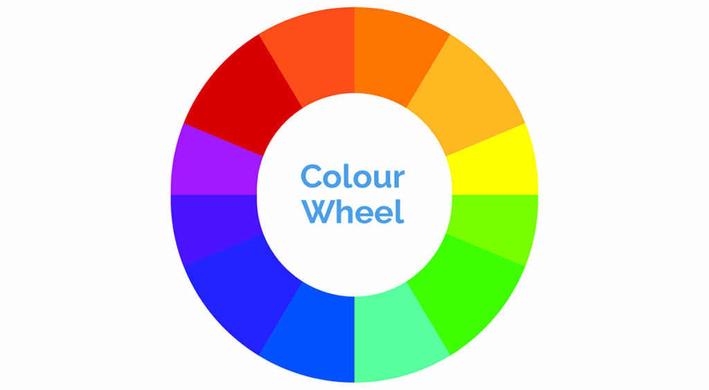
The colour wheel is a vital tool for selecting colour schemes. It displays primary, secondary, and tertiary colours alongside their associated hues, tints, tones, and shades. Mixing white, black, and gray with the original colours creates brighter, lighter, softer, and darker colours. This allows you to experiment and create unique colour schemes for your projects.
Definitions and Terms
Hue
The term ‘hue’ refers to the quality of colour that distinguishes it from other colours. It is essentially what colour you are specifying. Hue also refers to the dominant wavelength of colour out of the 12 basic colours. For instance, the hue of crimson is red.

Saturation
Saturation refers to the intensity of colour, or how pure a colour is. A high saturation indicates a very bright colour, while desaturation refers to a washed out or grayed out colour.

Varieties of Colour
Tints are colours created by adding white to a hue.

Shades are colours created by adding black to a hue.

Tones are colours created by adding grey to a hue.

Primary Colours
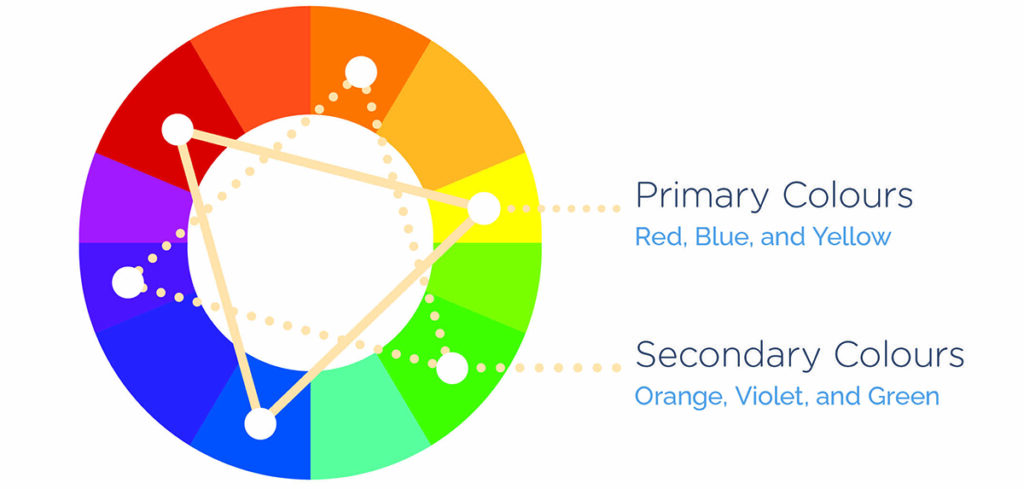
Red, blue, and yellow are considered “primary” colours because they cannot be created by combining other colours. They are the most fundamental and basic colours. Because they are the foundation of every colour, they can be mixed to create a vast range of colours.
Secondary colours are created by mixing two primary colours and are located between them.
Tertiary Colours
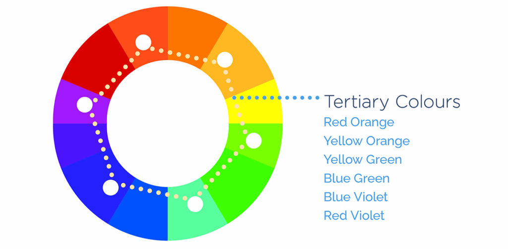
These colours are a blend of two secondary colours and are positioned between them in the colour wheel.
Colours in Context
Colour Harmony
Understanding colour theory can be achieved by first comprehending the significance of colour placement on the colour wheel and how it affects colour harmony. Warm colours, such as red, orange, and yellow, are associated with heat, fire, the sun, and blood. They are energizing in nature and create a feeling of excitement, movement, or passion. On the other hand, cool colours, such as blue, green, and purple, are associated with cold, night, stillness, despair, and sadness. They evoke feelings of peace or serenity and can be calming. It is important to note that the use of warm and cool colours can greatly impact your visual product.
Colour Schemes
- Complementary Colours
Opposite colours on the colour wheel are known as complementary colours. Because they are far away from each other, they create a dissonant relationship. When placed side-by-side, complementary colours can produce a lot of contrast, but we need to be cautious because it can be overwhelming to the viewer if used excessively. Additionally, complementary colours can easily compete with each other and create visual chaos. Therefore, it’s best to use one colour as a dominant shade and the other as an accent colour.
Alice in Wonderland movie poster using this color scheme

- Analogous Colours
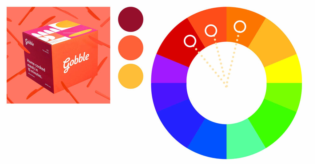
On the colour wheel, a combination of two to four colours that sit adjacent to each other is known as an analogous colour scheme. These colours have a harmonious relationship due to their close proximity. Even though they are considered to be a calm and relaxed combination, it is still recommended to choose one colour as the dominant and use the others as accents.
Gobble packaging box using this color scheme
- Triadic Colour scheme
To follow the triadic colour scheme, one needs to pick three colours that are equally spaced on the colour wheel. Despite their even distance, the colours may not always create a harmonious effect if not used properly. Therefore, it is still recommended to use one colour as the dominant and the other two colours as accents. This will help to create a visually appealing and balanced colour scheme.
The Burger King logo is great example of how to use this color scheme effectively

- Square Colour Scheme
For this colour scheme, we’ve used four colours that are equally spaced around the colour wheel, similar to the previous one. However, it’s important to note that the proximity of the colours can create patterns, but the use of more than one can cause dissonance. Therefore, we recommend you handle the colours with care and stick to the one dominant colour rule.
The colours used in this outfit are striking, an effective example of how to use the square color scheme. (Image AI generated)

- Tetradic (rectangle) Scheme
When it comes to utilizing colours in a painting, there are various methods that a painter can follow. One such method is the use of four hues, just like a square, where the colours are arranged in a manner that creates two complementary colours. While this method may be tricky to implement, it offers a lot of variety to the painter. However, it is recommended to follow the one dominant colour rule, which guarantees the best results. Additionally, when using the tetradic colour scheme, one should always consider the colour temperature.
Living room designed and furnished using this color scheme. (Image AI generated)

- Split Complementary Colours
When using a three-colour scheme, it is recommended to have one base colour and two additional colours that are adjacent to the base’s complementary colour. However, it is important to be careful with the proximity of these colours to avoid unwanted dissonance. Therefore, it is recommended to follow the one dominant rule.
The New Yorker Magazine cover using this color scheme

- The Monochromatic Colour Scheme
This scheme is based on one colour and its variations, achieved by adjusting saturation and brightness through addition of white, black, or gray.
A scene from the 2014 film The Grand Budapest Hotel by Wes Anderson

Colour Temperature
Colour Temperature
Colour temperature, in the context of colour theory, refers to the warmth or coolness of a colour. Warm colours, such as red, yellow, and orange, are generally bold and vivid. They tend to appear closer to the viewer, while cool colours, such as green, blue, purple, white, and gray, are considered calm and soothing in nature.
Cool colours tend to recede in space and create a sense of depth. For example, distant mountains might appear a cooler blue or purple, while objects in the foreground might have warmer notes. Artists can use warm and cool colours to create realistic and exciting works by understanding the temperature of a colour in the subject and using it accordingly in their paintings.
Warm Colours

Warm colours, in the realm of art, are those hues that impart a sense of warmth, such as red, orange, and yellow. These colours are often associated with fire, the sun, and heat. They can create an atmosphere of intimacy and excitement and make an area feel closer.
Colours: Red, orange, red orange, yellow, yellow-green, and red-violet.
Mood: Excitement, liveliness, joy, anger, love or passion.
Association: Summer, fall, fire, anger, and blood.
Property: They have a tendency to be more dynamic and colorful, thus attracting the attention of the viewer.
Cool Colours

In art and design, cool colours refer to hues that create a sense of coolness. These colours include blue, green, and pale purple. They are often associated with water, grass, and sky. The use of these colours can create a sense of distance and make an area appear further away. They are also capable of making a space feel more serene and calming, although they might also be associated with sadness and depression.
Colours: Blue, green, blue-green, violet, and blue-violet.
Mood: calm, serenity, sadness, stillness, death, and shadow, .
Association: Water, Ice, Sky, and Winter
Property: They create a calming effect on the viewer due to their receding and relaxing nature.
How to use warm and cool colours in art and design
Now that we know all about warm and cool colours let’s look at how to use them.
- Use warm colours to attract attention – The most important part of a piece is the focal point, where you want the viewer’s eye to be drawn. Warm colours can be used to attract attention to this area.
- Use cool colours to create a sense of space – If you want to create the illusion of depth or distance, use cool colours as they tend to recede, while warm colors come forward.
- Use warm and cool colours to create contrast – This will add visual interest. Warm colours create contrast in cool palettes.
- Be careful to consider the relative colour temperature. – The colours around a particular colour can affect the way it looks. So, when choosing a warm tone, you don’t necessarily have to stick to reds, oranges, and yellows. Even a blue with a slight tint of violet can be the warmest colour in your design, while still having all the warm tone properties.
Colour and the environment we live in
We have covered various aspects of colour including its definition, different characteristics, colour schemes and psychology. However, sticking to these guidelines can sometimes become tedious. Even the most skilled designers can face a creative block when it comes to selecting a new and exciting colour scheme for a project.
One way to find unique and creative colour combinations is by looking at the natural world around us. Nature offers some of the most fascinating colour combinations. Therefore, go outside, explore, and get inspired!

Notice the analogous colour of the plum blossoms, the complementary colours of the peacock’s plumage. Nature is indeed amazing!
Colour Blindness in Design

source: https://www.aoa.org
Did you know that 1 in 12 men and 1 in 200 of women worldwide are colour blind? If you have students who have this condition and wants to pursue a career in design, there are tons of information that you can share with them to make their journey easier, visit the website below for further information:

source: colorblindguide.com
You can also explore this game, designed for people with color perception deficiencies. https://color.method.ac
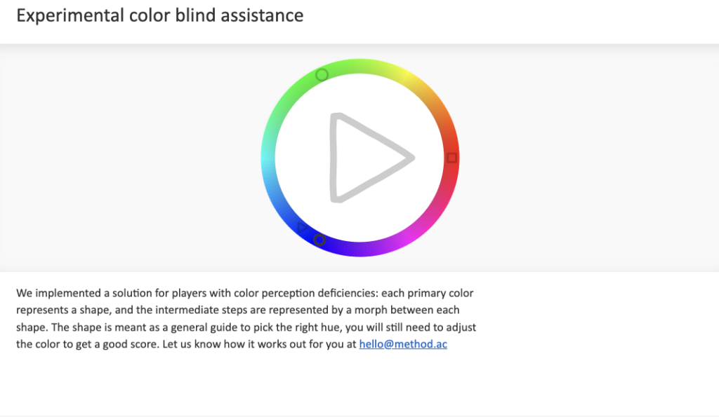
source: https://color.method.ac
Colour Blindness should also be one of the considerations when designing visuals and making colour choices.
Here are some design tips to consider to make your design inclusive:
- Many color blind individuals can’t perceive red, which is often used for danger. Consider incorporating textual or shape cues to reinforce the message.
- Color blind individuals struggle with certain hues but can discern differences in saturation and shade. This influences how you blend marketing colors.You can avoid fully saturated complementary colors like red-green. Instead, use lighter shades for better differentiation.
- Adding texture to similar colors helps, especially in charts and graphs. Consider using a different tone or adding a border.
Other helpful websites about Color blindness in Design
- How To Use Color Blind Friendly Palettes in Your Design – https://venngage.com/blog/color-blind-friendly-palette/
- A Designer’s Guide for the Color Blind – https://medium.com/kubo/seeing-the-unseen-a-designers-guide-for-the-color-blind-8a6da64fe14c
Technical References
Although design softwares, such as Adobe Indesign or open source ones like Affinity Publisher or Gimp can be an option to complete the suggested learning outcomes for this lesson, there are a lot of resourceful ways for your students to complete the activity. The important thing is the actual application of the concepts that is taught. Here are a few suggestions:
- Hand drawn Illustration
- Collage or cutting and pasting of illustrations or photos from magazines or newspapers
- Photography
- Photocopying
Indesign alternatives – https://www.creativebloq.com/features/indesign-alternatives
Read/Watch
1. Watch this video to learn more about the basics of using color in graphic design
In this video, you will learn about the color wheel and color harmony concepts, which are crucial for selecting colors that are visually pleasing, coherent, and impactful, resulting in an effective design. Additionally, the video covers common color mistakes and provides instructions on how to choose the right color and find inspiration.
2. Read this blog to learn more about colour psychology
https://visme.co/blog/color-psychology-in-marketing-the-ultimate-guide/

source: https://visme.co/blog/color-psychology-in-marketing-the-ultimate-guide/
Other helpful references
- Color tools for color palette, schemes, combinations and even gradients
https://www.sitejet.io/en/article/15-of-the-best-color-tools-for-designers - Color Tools And Resources
https://www.smashingmagazine.com/2021/07/color-tools-resources/ - 13 Useful Resources for Color Palette Inspiration
https://glorify.com/learn/10-helpful-resources-for-color-palette-inspiration
Reflection and guiding questions
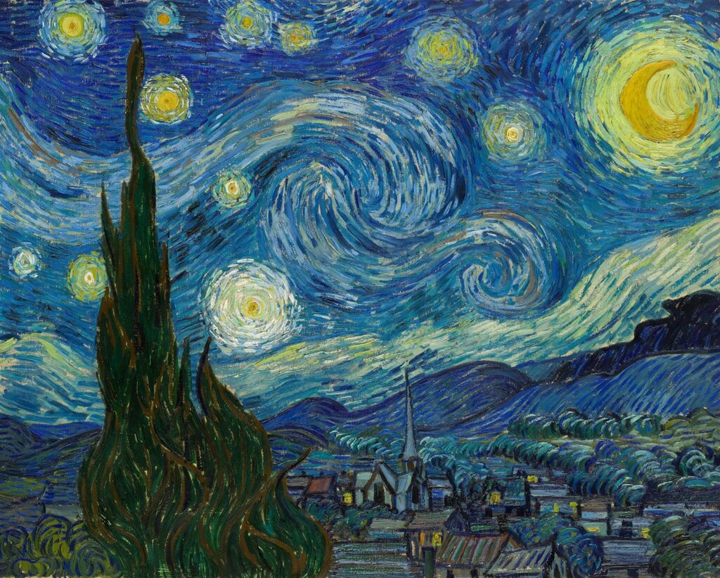
The Starry night by Vincent Van Gogh
Find one well-known Painting or Take a look at the brand logos of well-known brands. Try to identify the colors used by the designer or artist.
Here are a few guiding questions to help your students reflect on their observations:
– What colors did the artist or designer use?
– Can you identify the color scheme used by the designer or artist?
– Based on the lesson about color psychology, why do you think they used that particular color combination?
– What emotions or reactions do you think the artist or designer is trying to evoke?
Learning Activities to support this lesson
When teaching secondary students about colour in graphic design, it’s important to engage them actively and creatively. Here are some activities you could consider:
- Hands-on Colour Mixing: Provide students with paint or digital tools to physically mix colours and observe the results. This hands-on approach helps them understand the principles of colour theory firsthand.
Materials – Goauche paint, Poster Colour - Colour Wheel Exploration: Have students create their version of the colour wheel, either digitally or using physical materials. Encourage them to experiment with primary, secondary, and tertiary colours, and discuss the relationships between them.
- Practical examples: Show students examples of effective graphic designs that use colour well. Analyze advertisements, posters, and other visual materials to identify how colour contributes to the overall message and impact.
Materials – Magazines, Websites, actual samples of posters, flyers, brochures - Colour Psychology Discussions: Discuss the psychological effects of different colours and how they can influence perception and mood. Encourage students to consider the emotional impact of colour choices in their designs.
- Technology Integration: Integrate digital tools such as graphic design software or online colour palette generators into the curriculum. This allows students to explore colour theory concepts in a contemporary context and develop practical skills for digital design.
By incorporating a variety of instructional strategies, you can create a dynamic and engaging learning experience that effectively teaches secondary students about colour in graphic design.
Leave a Reply
You must be logged in to post a comment.