Typography is the skillful arrangement of text to create a visually pleasing and easy-to-read composition, serving as a fundamental component of design. Designers utilize typography to organize typefaces within a user interface, ensuring readability, scalability, and aesthetic appeal. Effective typography enhances a product’s visual appeal, improves user-friendliness, and positively impacts brand perception.
Typography is fundamental to every form of design, and choosing the right typeface and font is critical to the success of any project. While you may excel in colour selection, creating balanced layouts, and perfecting composition, neglecting font choice can undermine all your efforts and hinder your objectives.
Reflecting on my early days as a designer, I recall how typography often took a backseat in my process. Many designers, especially beginners, tend to prioritize visuals and imagery over typography. However, this shouldn’t be the case. The ability to select the right typeface and font is a skill in itself, as not all fonts are created equal, as the saying goes.
To delve into this topic, let’s explore common typographical terms and discuss strategies for selecting and pairing fonts. By continuously experimenting and learning, we uncover one of the most crucial aspects of design: typography.
Lesson Outline
- Definitions and terms
- How to select and combine Typefaces
- Other relevant terminologies to remember
- Use and application of typography
- Inclusive typography
- IndigenousTypography
- Technical References
- Reflection and guiding questions
- Suggested Learning Activities to support this lesson
Learning outcomes:
At the end of the lesson educators shall be able to teach their students to:
• Recognize how typography affects readability, scalability, aesthetics, and brand perception, and how effective typography enhances product visuals and user-friendliness.
• Identify key typographical terms and their importance in text appearance and readability, including typeface, font, size, weight, width, italics, kerning, tracking, leading, and hierarchy.
• Explore typeface classifications and variations. Identify and explain uses for serif, sans-serif, and display fonts. Recognize variations within typefaces, such as size, weight, width, and italics, and explain their impact on text presentation.
• Learn how to effectively utilize typography to enhance brand recognition, user engagement, and decision-making. Acquire strategies for organizing elements, establishing hierarchies, and guiding reader attention through font selection.
• Apply typography principles in design: Implement best practices for combining and pairing typefaces to create visually appealing compositions. Develop practical skills in selecting fonts tailored to specific design purposes, considering tone, readability, and legibility.
• Develop critical thinking and design skills: Analyze and evaluate typography’s effectiveness in diverse design contexts. Apply knowledge and skills to make informed decisions regarding font selection and typography in design projects.
Definitions and terms
Typeface VS Fonts
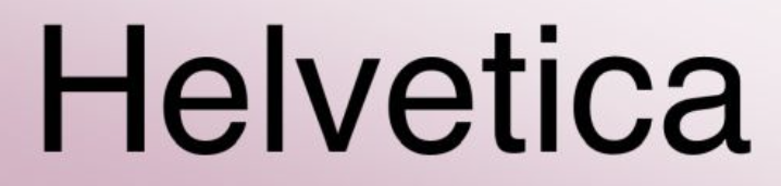
The distinction between font and typeface lies in their relationship. A typeface encompasses a set of characters with a shared design, like Helvetica. However, within the typeface, there are different fonts, each varying in weight, style, and size, such as Helvetica Regular in a specific size.
Typeface
Typeface encompasses the entire family of fonts, each varying in size and weight. Confusion often arises because it is often used interchangeably with the word font. While this might not be a major concern it matters especially when discussing design projects. For instance you’d have to communicate to someone about the font used, you will likely seek specific details, such as the exact font like “Roboto Medium 9 point,” rather than just the typeface “Roboto.”
Therefore, what we commonly call a font is typically a typeface, such as Times New Roman or Montserrat.
There are several different typeface classifications, including:
Serif – Serif typefaces feature small lines or embellishments at the ends of letter strokes, whereas sans-serif fonts lack these additions. Serif examples include Times New Roman, Georgia, and Baskerville, while sans-serif examples include Arial, Helvetica, and Calibri.
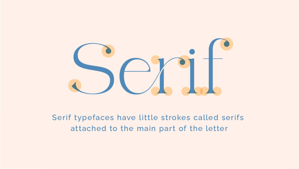
Examples of Serif typefaces

San Serif – Sans serif typefaces are viewed as more contemporary compared to serif typefaces. They lack the distinguishing strokes of serif typefaces, hence the use of the French word “sans,” meaning “without.” Sans serif typefaces are frequently chosen to convey cleanliness, minimalism, friendliness, or modernity.
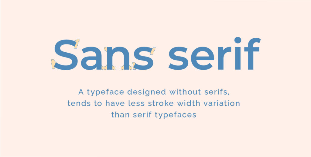
Examples of Sans Serif typefaces

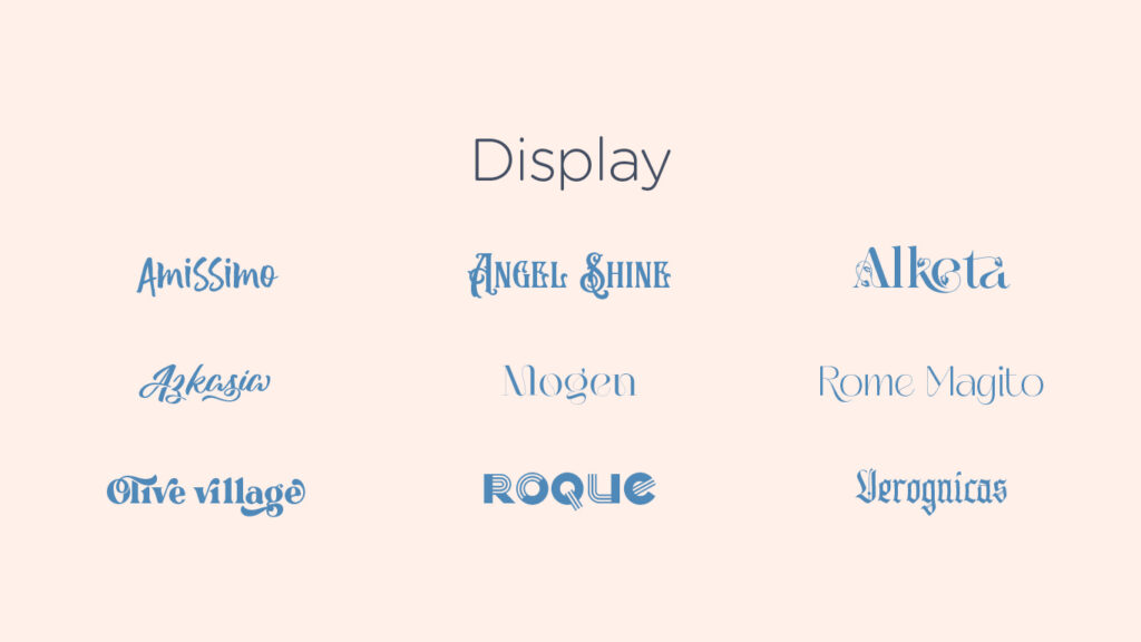
Display Typefaces – Display typefaces come in various styles, such as script, blackletter, all caps, and decorative variants. They are best used for limited text, such as titles, headers, and designs that need a strong visual emphasis. Display fonts are ornamental and not intended for use as body text.
Examples of Display typefaces
What is a font?
A font provides a more precise definition of the text style by specifying both its size and weight within a typeface. For instance, consider the typeface Helvetica Neue:
• Helvetica is a typeface
• Helvetica Regular and Helvetica Bold are two distinct fonts under the typeface Helvetica
Here are ways that fonts of the same typeface can vary from one another:
- Size – Font size is the height of a typeface and is measured in points, where one point equals 1/72nd of an inch. It determines the visual prominence of text on digital platforms like computers and websites. Technically, a font in two different sizes are different, even when the typeface is identical. That’s right—Gotham 12 pt and Gotham 16 pt are two distinct fonts.

- Weight – Weight refers to the thickness of a typeface’s stroke in a particular font. While regular and bold are commonly known weights, the range can extend from very light to very heavy.

- Letterform width – Spacing further highlights the difference between typefaces versus fonts. There’s a whole range of letterform widths: compressed, condensed, semi-condensed, narrow, normal, extended, extra extended, and expanded. Just like font weights, different widths indicate different fonts.

- Italics – Italic is a font style characterized by a slanted appearance to the right. It’s commonly utilized by writers to emphasize specific words or phrases. Additionally, it can denote a character’s speech or highlight stressed words. Italic type is also suitable for foreign language words or the titles of longer works such as novels or films.

How to select and combine fonts
When to use Serif Fonts
Serif fonts are often chosen for their authoritative and professional appearance, suggesting a sense of history or experience. They are reminiscent of typewriters and are still used by longstanding institutions like The New York Times. These fonts can give a vintage feel and are used to evoke earlier eras. Additionally, serif fonts enhance legibility, especially in small text sizes, making them ideal for body copy in printed materials.

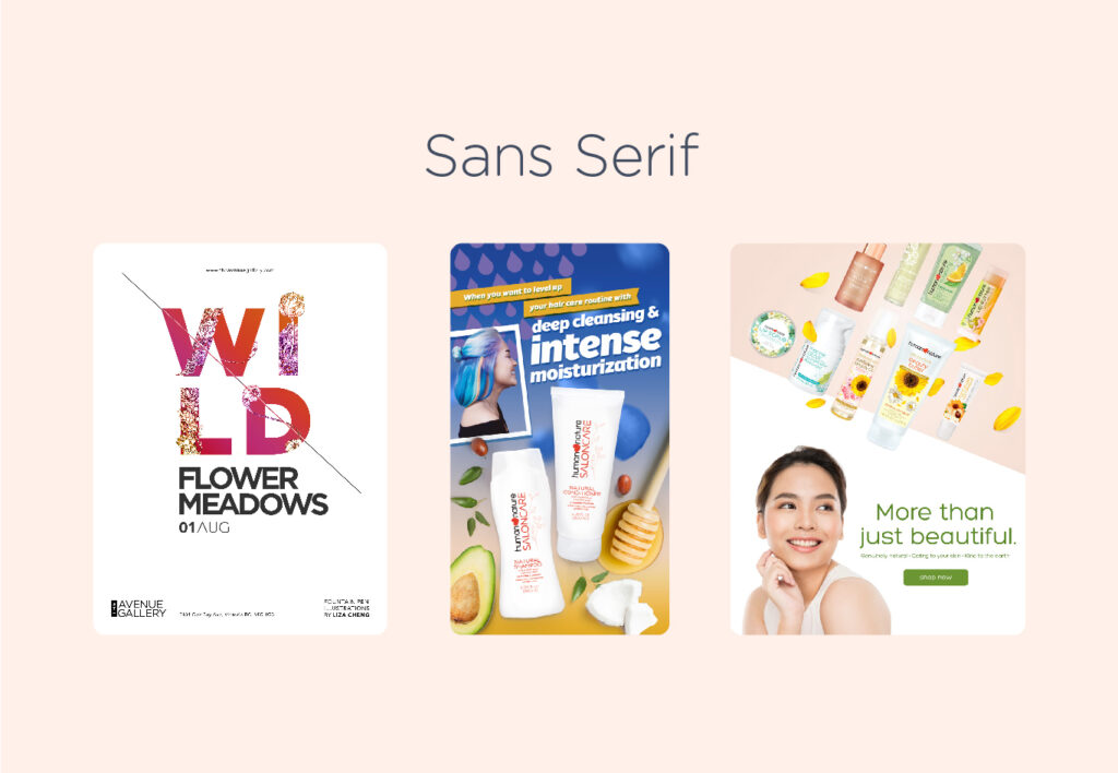
When to use Sans Serif Fonts
Sans-serif fonts are typically associated with modern typefaces, with Futura being one of the first popular sans-serif fonts, followed by Helvetica. Sans-serif fonts are often preferred for situations where space is limited, such as signs, apps, and map labels. However, certain sans-serif fonts, like Arial and Helvetica, are also suitable for longer passages of text known as body copy, although there are some exceptions.
When to use Display Fonts
The primary purpose of this typeface is aesthetics rather than readability, making it commonly used in brand names, logos, and short titles.
Decorative typefaces are ideal for expressing additional personality, emotion, and uniqueness through font selection.

Font Selection Best Practices:
- Identify Purpose and Message – Determine the intended use of the font. Select a typeface that reflects the desired message and tone.
- Prioritize Legibility – Choose a body font that is easy to read and legible.
- Effective Pairing – Avoid pairing similar fonts; opt for complementary styles like pairing a Sans Serif with a Serif font. Experiment with tracking to alter font appearance.
- Understand Typeface Usage – Understand the appropriate usage scenarios for the selected typeface. Tailor font choice to match the message being conveyed.
- Simplicity and Clarity -Limit the number of fonts used per project; aim for two fonts for clarity.
- Organization for Efficiency – Create a collection of typefaces categorized by suitability and industry. Maintain collections for headline, subheading, and body copy fonts, and categorize fonts based on industry suitability for efficient access and use.
Other relevant terminologies to remember
Kerning – Kerning refers to the spacing between letters or characters. Adequate kerning ensures that letters or characters don’t appear too close together. Insufficient kerning can lead to misinterpretation of text by readers.

Tracking – The adjustment of spacing between letters is known as tracking or letter spacing. Typically, positive tracking is applied to create a more open and spacious layout. As text size increases, letter spacing also increases, necessitating a decrease in tracking. Conversely, for smaller text sizes, tracking needs to be increased.

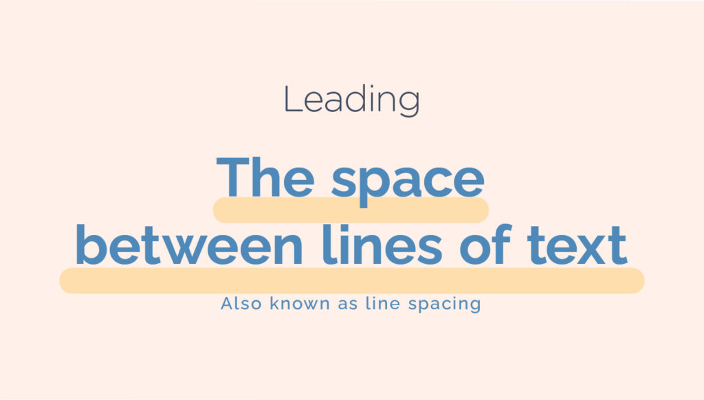
Leading – The space between two lines of text is referred to as line spacing or leading. By adjusting the leading of a paragraph, we can add visual appeal and establish hierarchy.
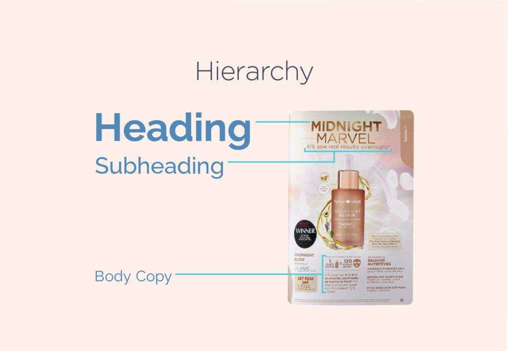
Hierarchy – Hierarchy guides readers by using different levels of emphasis to show them where to start and where to go next. To establish hierarchy, make the most important items stand out by using larger, bolder, or different styles. Keeping it simple with just a few complementary styles is key.

Use and application of Typography principles
Here are a few examples of design output where effective font selection and pairing are put into practice:
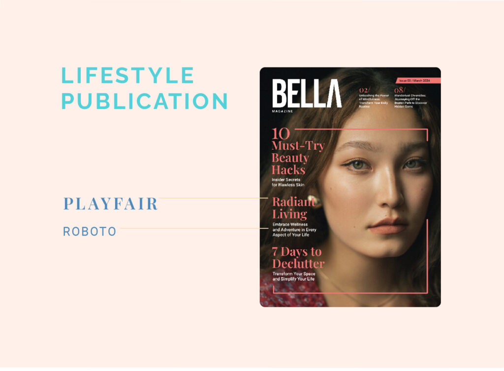
Magazine Cover – Display Typeface for the Magazine Title, Serif font for the headers and Sans serif font for the short description of the articles
Menu – Display Typeface for the header and simple sans serif for the body copy

Fashion Poster – Bold Serif font to highlight the promotion and thin sans serif for the details

Inclusive Typography
We can educate our students to design with empathy, promoting inclusivity and accessibility in their designs. Similarly, as educators, we can tailor our learning resources to create an inclusive and welcoming environment for all learners.
By teaching aspiring designers to be able to carefully choose the right font, we can make sure that everyone, regardless of their neurodiversity, can access and benefit from the material.
Here are ways where we can practice inclusivity and empathy through typography:
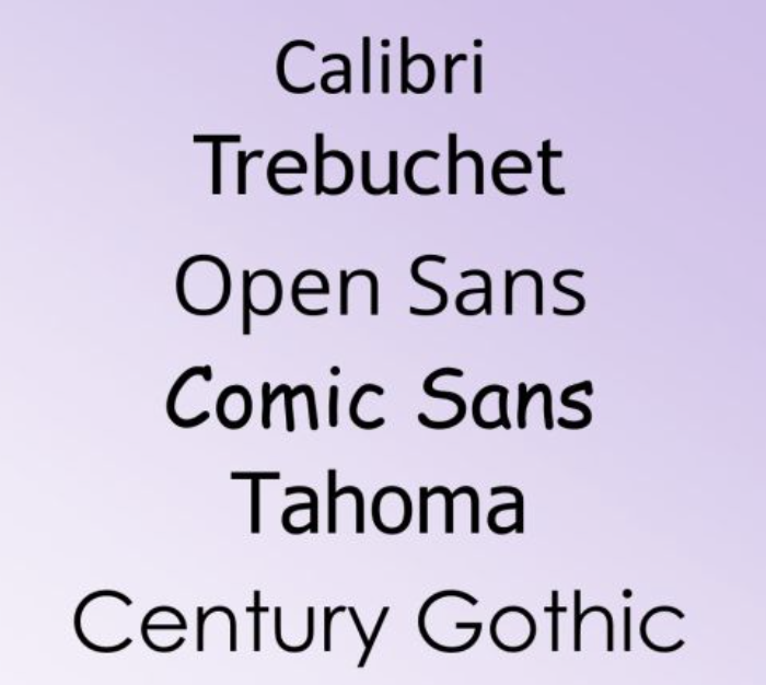
- Research shows that fonts with more natural and easy-to-read shapes, like those with unique forms for letters like ‘b’ and ‘d’, such as Century Gothic, Trebuchet, Calibri, Open Sans, and Tahoma, can be helpful for individuals with dyslexia.
Source – https://www.weareteachers.com/best-fonts-for-dyslexia/
2. Fonts with small decorative strokes, known as serifs, can be harder to read for neurodiverse people. They tend to prefer simpler, sans-serif fonts like Arial. Roboto or Helvetica which have cleaner lines and shapes.
3. Some individuals with neurodiverse conditions may find fonts that resemble handwriting, such as Comic Sans, appealing. However, these fonts can cause confusion between certain letter combinations. Fonts where each character occupies the same amount of space, such as Consolas or Courier New, are more suitable for neurodiverse readers as they can minimize confusion between letters.
4. Specific fonts, like Open Dyslexic and Dyslexie, are designed to be easier for dyslexic individuals to read.

Source – https://nycdyslexiaresearch.wordpress.com/2013/03/08/dyslexie-versus-opendyslexic/
5. The size of letters, especially the parts that stick up or down (called ascenders and descenders), is also important. Since dyslexic readers often rely on recognizing the shapes of words, shorter ascenders and descenders can make words harder to decipher and slow down reading.
6. Text size matters as well. Neurodivergent individuals should be able to adjust text size to suit their needs. Having a line spacing of at least 1.2 and sometimes increasing the space between characters can make reading easier for neurodivergent students.
Other helpful websites about this topic:
- The Power of Tactile Typography – https://venngage.com/blog/color-blind-friendly-palette/
- Beyond Braille: A Look at 3 New Typographic Systems for Blind People – https://medium.com/kubo/seeing-the-unseen-a-designers-guide-for-the-color-blind-8a6da64fe14c
Indigenous Typography
Did you know that the province of British Columbia has its own custom typeface?
BC Sans (2.0) is an open-source font created specifically for government use to enhance the legibility and accessibility of digital services. It was crafted to accommodate unique characters and syllabics present in Indigenous languages within British Columbia. BC Sans is mandated for implementation across all existing and future government webpages on gov.bc.ca, as well as on government services not hosted within the gov.bc.ca domain.
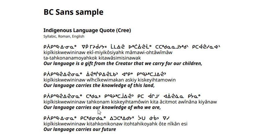
Source – https://crankymedia.com/new-open-source-sans-font-from-bc-the-government/
“BC Sans is a gesture towards bringing reconciliation to life.”
– Andrew Pratt, Former GCPE Graphic Communications Director and one of the initial founders of the BC Sans typeface
Source: https://www2.gov.bc.ca/gov/content/governments/services-for-government/policies-procedures/bc-visual-identity/bc-sans
Similarly, The Philippines also have their own indigenous script called Baybayin, also previously referred to as alibata. It falls under the category of Brahmic scripts, specifically an abugida. Historically, it was extensively utilized in Luzon and various regions across the Philippines from the 16th to the 17th centuries until it was supplanted by the Latin alphabet during the era of Spanish colonization.
The Baybayin Script
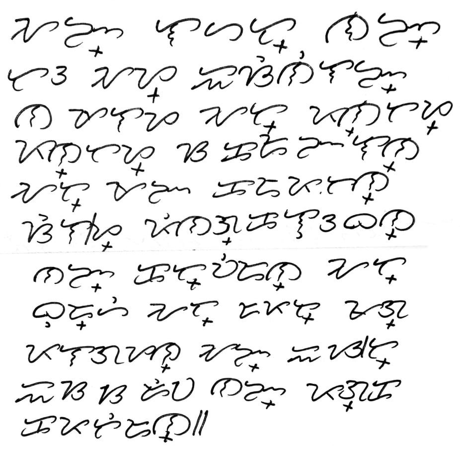
Source: https://en.wikipedia.org/wiki/Baybayin#/media/File:Article_1_of_UDHR,_Handwritten_in_Filipino_Baybayin_Script.jpg
Efforts to promote Baybayin, the indigenous script of the Philippines, are gaining momentum nationwide. The National Museum and Commission on Culture and Arts have dedicated spaces to display various written forms of the script. In previous congressional sessions, the House of Representatives took steps to revive Baybayin and other traditional writing systems, aiming to promote, protect, and preserve them as vital cultural assets. The Department of Education and the Commission on Higher Education have likewise incorporated Baybayin into their educational curricula, ensuring that students learn about its historical and cultural importance.
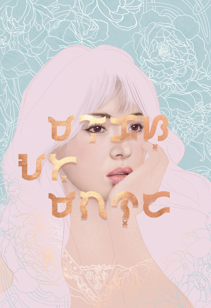
A digital art I made with the Babybayin inscription meaning Malakas at Maganda (Strong and Beautiful)
Technical Resources
Although it is best to have industry recommended software to practice typography, softwares like Microsoft word or any word processing software can be used as well. Newspapers and Magazines and anything with printed words can also be useful tools for students to appreciate the art of typography.
Below are a few useful resources that you and your students can check out:
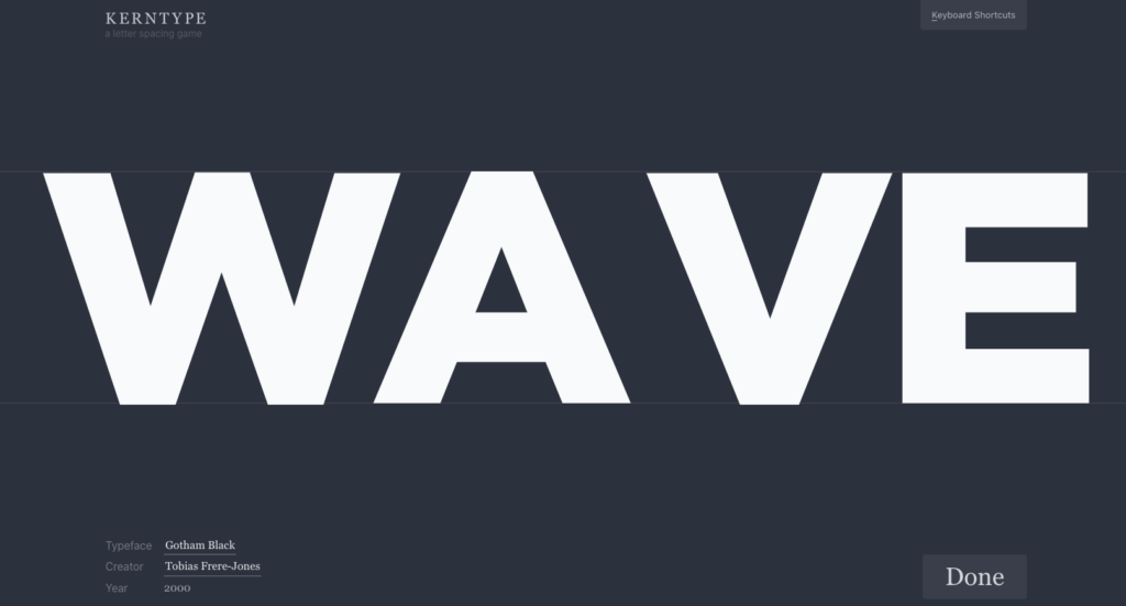
- Kerning and Tracking game – This is a fun game that can provide students with an opportunity to practice identifying the optimal spacing between characters. The objective of the game is to attain text that is both readable and visually pleasing.
Link – https://type.method.ac
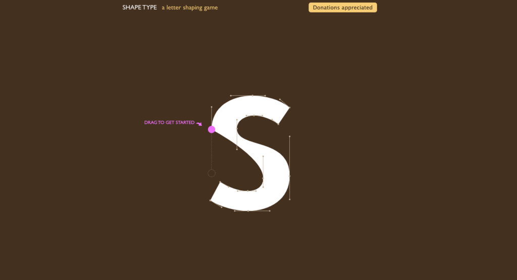
2. Shape type game – Shape Type is an HTML5 typography game where players must utilize curve-adjustment tools to refine letterforms across different font styles. The more accurately you match the letter’s shape, the higher your score will be.
Link – https://shape.method.ac
Read/Watch
1. Watch this video to learn more about the basics of typography
This video covers key aspects of typography, including using and combining different fonts to enhance visual impact, avoiding fonts that compromise design integrity, and explaining typography terminology like hierarchy, leading, tracking, and kerning.
2. Read these blogs to learn more about Typography in graphic design and font pairing:
• Why Is Typography Important in Graphic Design? – https://www.flux-academy.com/blog/why-is-typography-important-in-graphic-design#:~:text=Typography%20has%20two%20main%20purposes,and%20easy%20on%20the%20eyes
• How to combine fonts – rules, tips and tricks – https://sketchdeck.com/blog/combining-fonts/
• 5 Common Typography Applications and Use Cases (and How To Design for Them) – https://www.andacademy.com/resources/blog/graphic-design/common-typography-applications/
Reflection and guiding questions
Typography is a powerful communicator; it establishes tone and pervades our surroundings, from signage to street signs. It holds the ability to shape the identity of spaces and even entire cities. Consider iconic examples like “I heart New York” or the typography of the London subway system.

Source – https://www.papier.com/us/thefold/articles/stylish-city-fonts
A Typography Walk
Ask your students to capture photographs of fonts they admire while exploring their neighborhoods, downtown areas, or even within your school. Prompt them to document at least five distinct typefaces. To further explore their choices, consider asking these questions such as:
1. What drew you to this particular font? How does it complement its surroundings? What is the tone of the font?
2. What characteristics of the font that you particular like? Is it a serif, a sans serif or a display font?
3. Think about what kind of businesses or places the font might fit best. Do you think it’s being used in the right way, or could it work better somewhere else? How flexible do you think this font is for different situations?
4. Ask students to find out the name of the font and do a bit of digging into its history
5. Consider what feelings or vibes the font gives off to people who see it. Does it grab your attention, feel understated, or make you curious about something?
Encouraging thoughtful reflection can deepen their appreciation for typography.
Suggested Learning Activities to support this lesson
- Design your own typefaces – Encourage your students to create their own fonts using various methods. They can opt for freehand illustration on graphing paper or utilize online platforms like FontStruct. Through FontStruct, students can effortlessly design a comprehensive alphabet for downloading and practical use.

2. Creative word play – One interesting creative exercise is to compile a list of words and ask each student to choose one from the list. The task is to create an illustration that represents the meaning of the chosen word through typography. This exercise can be done digitally, by sketching, or by copying illustrations from magazines. The objective is to craft the typography in a way that visually reflects the meaning of the word itself.

3. Encourage students to have their own typeface collection in order to streamline the design process and save time. By listing and organizing fonts suitable for different text types – such as headlines, subheadings, and body copy – they can easily find the right options. Additionally, it is helpful to categorize fonts by industry; for instance, formal fonts would be suitable for Real Estate, Banking, and Insurance, while others may be more fitting for retail, restaurants, or resorts. Having these collections organized and readily available can greatly facilitate a designer’s work.
Leave a Reply
You must be logged in to post a comment.