The fundamentals of design such as lines, shapes, textures, and balance, are ubiquitous in visual creations. They serve as the foundation for all visual content. Initially, these basics may seem daunting, especially if you don’t consider yourself a designer.
However, understanding these fundamentals is simply about grasping each component and leveraging it effectively. This knowledge is invaluable for various projects, whether you’re crafting graphics or enhancing designs. It’s essential for designers, regardless of their experience level, to comprehend how design elements and principles interact and to apply them purposefully in their projects to achieve visually appealing and functional result.
Lesson Outline
Definition and terms with samples on how to implement the fundamentals of design to enhance your designs.
Technical References
Suggested Learning Activities
Learning Outcomes
At the end of the lesson educators shall be able to teach their students to:
Develop a thorough understanding of the fundamental elements of design, such lines, shapes, textures, and balance, and their significance in visual compositions.
Gain proficiency in applying design fundamentals to enhance the aesthetic appeal and functionality of various design projects.
Engage in learning activities aimed at practicing and reinforcing the application of design fundamentals in real-world design scenarios.
Cultivate the ability to recognize and analyze how design elements and principles interact within visual compositions, facilitating intentional and purposeful design decisions.
Develop creative problem-solving skills through the application of design fundamentals to address design challenges effectively.
Definition and terms
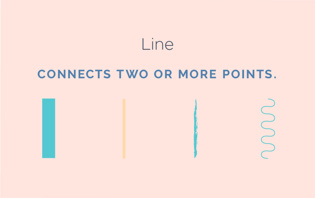
Line – A line is a connection between two or more points. They can vary in thickness, waviness, or jaggedness. Lines are often found in design, in drawings, illustrations, infographics, maps, and graphic elements like icons, textures and patterns. They are also used in simpler compositions to add emphasis, to organize and add appeal. When working with lines, consider its characteristics such as weight, color, texture, and style, as these subtle variations significantly influence design perception and their purpose. Explore how lines manifest in unexpected places, such as within text, where experimenting with different qualities can yield diverse outcomes.
In the example below, Lines are used to point the important parts of the product.
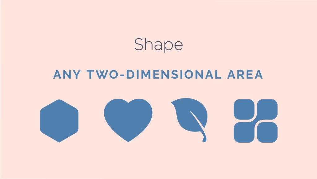
2. Shape – Shapes are two-dimensional forms that are closed areas with defined length and width. They can take various forms such as circles, squares, and triangles, and are categorized into two main types: geometric and organic. Geometric shapes are characterized by regularity, while organic shapes exhibit fluid contours. Artists and designers use shapes as foundational components in rendering images visually and conceptually. By applying shading techniques, shapes can be imbued with the illusion of depth, making them resemble their three-dimensional counterparts and forms.
Shapes are essential in visual communication as they help recognize symbols from street signs, abstract art, and other images.
In everyday design, shapes are essential for organizing content, creating illustrations, and enhancing visuals. They form the basis of various elements and hold significant importance.
In the example provided below, I utilized a variety of shapes to highlight and depict relevant data:
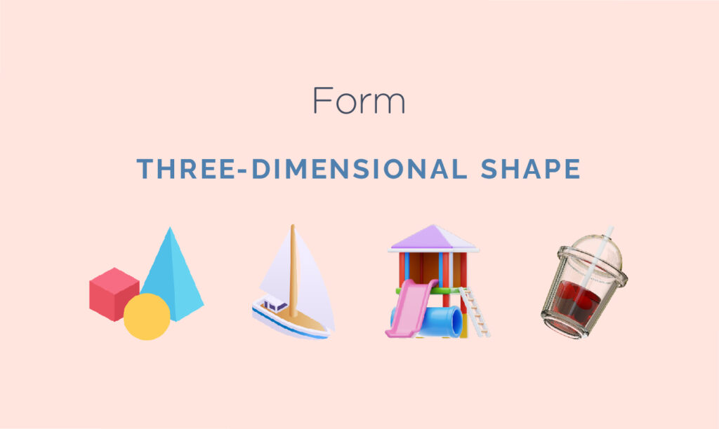
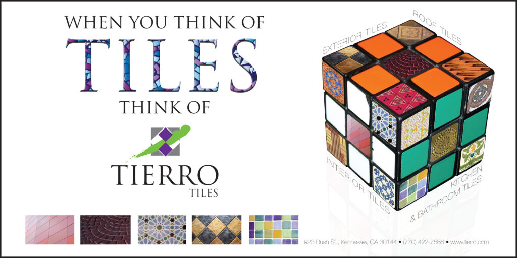
3. Form – When a shape becomes three dimensional, it is known as form. Forms are present in sculptures, architectural structures, and various three-dimensional objects. Forms can also be suggested through artistic techniques, utilizing elements such as light, shadow, and perspective to create a sense of depth.
Even in less realistic forms such as illustrations, artists use similar techniques to give the impression of depth. A simple shadow can create the illusion of layers or provide context to an object by giving it a sense of spatial placement.
In the example below, a Rubik’s Cube was used to suggest a mix-and-match approach when selecting tiles for your home.
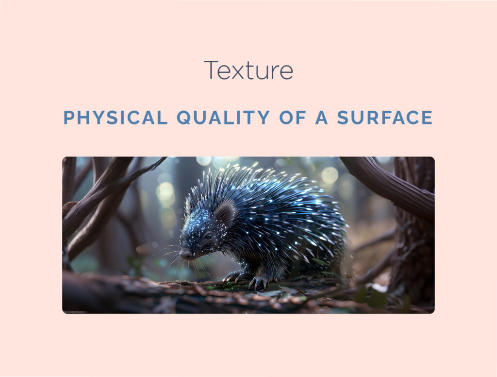
4. Texture – Texture pertains to the tactile quality of a surface. It can be an integral part of a three-dimensional object. In design, texture adds depth and tactile sensation to otherwise flat visuals. Surfaces may convey smoothness, roughness, hardness, or softness, depending on various elements at play. Textures make excellent background elements and add considerable intrigue to creative endeavors. However, it is important to exercise caution to avoid excessive texture as it can quickly overwhelm the viewer.
In the sample poster below promoting a sports tryout event, the background resembles a grass texture of a sports field, subtly evoking the theme of athleticism and sportiness:
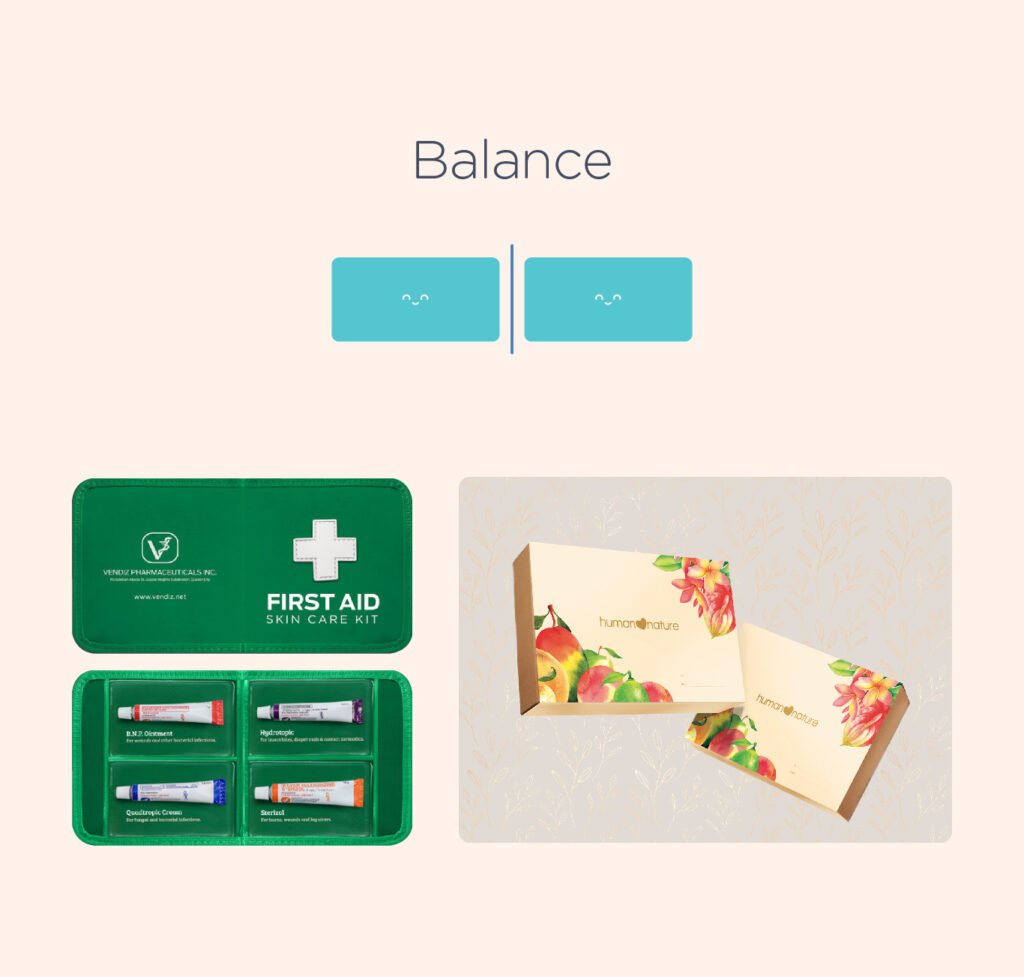
5. Balance – Balance in design refers to the equal distribution of visual weight, which can be influenced by various factors such as color, size, quantity, and negative space. Achieving a balanced composition can be challenging for beginners, as it relies heavily on intuition.
Symmetrical designs are characterized by the presence of identical or similar elements on both sides of an axis, creating a sense of balance and harmony through uniformity. On the other hand, asymmetrical designs use different elements to create a balanced composition, without necessarily maintaining perfect symmetry. This is achieved by strategically placing contrasting elements to draw attention to focal points, resulting in an overall sense of balance and visual interest.
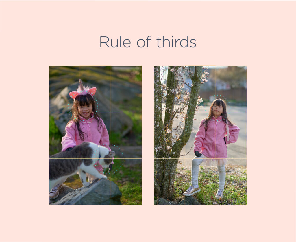
6. Rule of thirds – Many designers and photographers use a technique called the rule of thirds. This method involves dividing the workspace into a 3×3 grid and placing the focal point on or near one of the grid lines. This creates a visually pleasing composition that is easy for the human eye to follow. Research suggests that people naturally follow this orientation when viewing a design.
In the example below, the product is strategically positioned at one of the intersection points of the grid, ensuring that viewers are immediately drawn to it.
To create shapes, lines, and forms, you’ll need vector graphic tools. While Illustrator is widely accepted in the industry, there are also other open-source and affordable alternatives available for you and your students to explore and practice creating vector graphics.
Create Icons – Using what they have learned about the fundamentals of design ask your students to create an icon. Icons are images that visually represent individuals, locations, or objects. Unlike pictograms or symbols, they are more realistic and need to closely resemble their subject to be universally understood. Icons are often used on signage, mobile devices, the internet, and in places where instructions or information needs to be communicated without the use of words.
No software is required; a graphing notebook or pad and pen will suffice. Utilizing their understanding of color, instruct them to add meaning through coloring.
Teaching the intricacies of colour and its application in graphic design can be a daunting challenge due to its expansive nature. However, using its inclusion in high school art classes can makes it easier to teach. Instead of just studying colors in paintings, this playbook’s approach focuses on understanding colors in design. It serves as a connection between traditional art courses and practical design applications while traditional visual arts courses delve into colour through analysis of various paintings and artworks, these lessons focus on dissecting colours within the context of design applications.
Understanding colour in design is crucial for aspiring designers for several reasons. Colour communicates messages, emotions, and intentions that vary culturally, socially, and psychologically. Colours define brand identity, establish visual hierarchy, and enhance aesthetic appeal. In digital and product design, colour choices impact usability and accessibility. Designers must be mindful of cultural nuances to avoid conveying unintended messages. Learning colour theory empowers designers to create compelling and culturally relevant designs.
This lesson will include a review of the colour theory, colour harmony, psychology of colour, as well as suggested activities that students can do to apply what they have learned. While these principles might be familiar to educators, my focus is on demonstrating how they relate to practical design output and, more importantly, how they apply to various design solutions and products. Lesson Outline
What is Colour?
The Colour Wheel
Definitions and Terms
Colours in Context
Colour Temperature
Colour and the environment we live in
Colour Blindness in design
Technical References
Reflection and guiding questions
Suggested Learning Activities to support this lesson
Learning Outcomes
Upon completion of this lesson, educators will be able to teach students to effectively apply principles of colour theory and harmony in the creation and revision of advertisements, demonstrating an understanding of effective colour usage.
At the end of the lesson, educators will be able to teach students to develop the ability to discern and select cohesive colour palettes that harmonize effectively, enhancing the visual impact of their designs.
Through exploration of various colour combinations, educators will be able to teach students to gain insight into the intricate relationships between colours, enabling them to make informed choices in their design work.
Content
What is Colour?
Our eyes perceive colour as a result of light bouncing off objects and entering our eyes, which then interpret the combinations of light to create colour.
What is Colour Theory
Colour theory is the study of the principles of colour, both in science and art. It explores colour in relation to other hues and its measurements. Colour theory sets the foundation for artists to work with colours. However, it’s important to note that these principles are not absolute rules. They should be used as guidelines and not restrict your creative process. The logical structure of colour theory can be divided into three categories – The colour wheel, colour harmony, and colours in context.
Why is Colour Theory important?
Colour schemes play a vital role in branding, promotion, and sales. The right colour can make your brand stand out and attract your target audience. Understanding colour associations and avoiding poor colour combinations can help you create effective ads, make better branding decisions, and boost your sales. So, use colour theory to your advantage and create a brand that resonates with your audience.
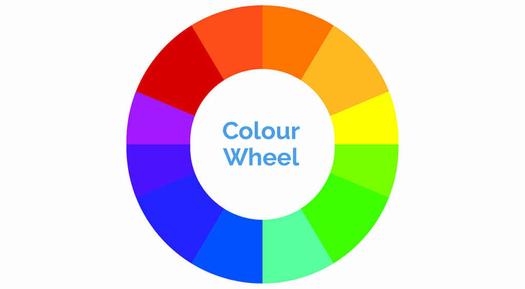
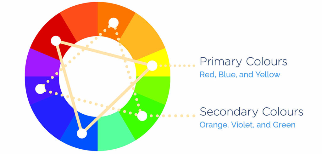
1 – The Colour Wheel
The colour wheel is a vital tool for selecting colour schemes. It displays primary, secondary, and tertiary colours alongside their associated hues, tints, tones, and shades. Mixing white, black, and gray with the original colours creates brighter, lighter, softer, and darker colours. This allows you to experiment and create unique colour schemes for your projects.
Definitions and Terms
Hue
The term ‘hue’ refers to the quality of colour that distinguishes it from other colours. It is essentially what colour you are specifying. Hue also refers to the dominant wavelength of colour out of the 12 basic colours. For instance, the hue of crimson is red.
Saturation
Saturation refers to the intensity of colour, or how pure a colour is. A high saturation indicates a very bright colour, while desaturation refers to a washed out or grayed out colour.
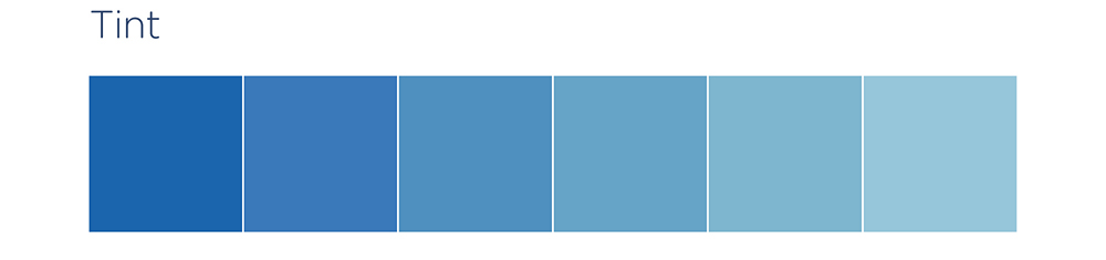
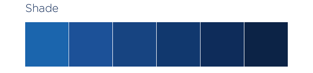
Varieties of Colour
Tints are colours created by adding white to a hue.
Shades are colours created by adding black to a hue.
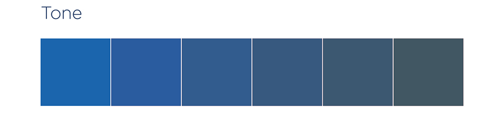
Tones are colours created by adding grey to a hue.
Primary Colours
Red, blue, and yellow are considered “primary” colours because they cannot be created by combining other colours. They are the most fundamental and basic colours. Because they are the foundation of every colour, they can be mixed to create a vast range of colours.
Secondary colours are created by mixing two primary colours and are located between them.
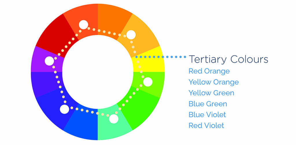
Tertiary Colours
These colours are a blend of two secondary colours and are positioned between them in the colour wheel.
Colours in Context
Colour Harmony
Understanding colour theory can be achieved by first comprehending the significance of colour placement on the colour wheel and how it affects colour harmony. Warm colours, such as red, orange, and yellow, are associated with heat, fire, the sun, and blood. They are energizing in nature and create a feeling of excitement, movement, or passion. On the other hand, cool colours, such as blue, green, and purple, are associated with cold, night, stillness, despair, and sadness. They evoke feelings of peace or serenity and can be calming. It is important to note that the use of warm and cool colours can greatly impact your visual product.
Colour Schemes
Complementary Colours
Opposite colours on the colour wheel are known as complementary colours. Because they are far away from each other, they create a dissonant relationship. When placed side-by-side, complementary colours can produce a lot of contrast, but we need to be cautious because it can be overwhelming to the viewer if used excessively. Additionally, complementary colours can easily compete with each other and create visual chaos. Therefore, it’s best to use one colour as a dominant shade and the other as an accent colour.
Alice in Wonderland movie poster using this color scheme
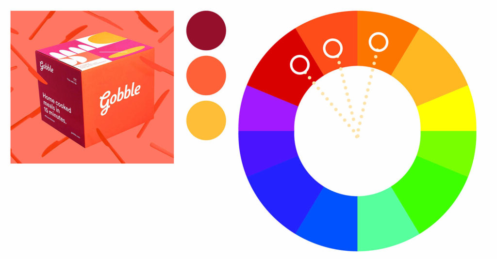
Analogous Colours
On the colour wheel, a combination of two to four colours that sit adjacent to each other is known as an analogous colour scheme. These colours have a harmonious relationship due to their close proximity. Even though they are considered to be a calm and relaxed combination, it is still recommended to choose one colour as the dominant and use the others as accents.
Gobble packaging box using this color scheme
Triadic Colour scheme
To follow the triadic colour scheme, one needs to pick three colours that are equally spaced on the colour wheel. Despite their even distance, the colours may not always create a harmonious effect if not used properly. Therefore, it is still recommended to use one colour as the dominant and the other two colours as accents. This will help to create a visually appealing and balanced colour scheme.
The Burger King logo is great example of how to use this color scheme effectively
Square Colour Scheme
For this colour scheme, we’ve used four colours that are equally spaced around the colour wheel, similar to the previous one. However, it’s important to note that the proximity of the colours can create patterns, but the use of more than one can cause dissonance. Therefore, we recommend you handle the colours with care and stick to the one dominant colour rule.
The colours used in this outfit are striking, an effective example of how to use the square color scheme. (Image AI generated)
Tetradic (rectangle) Scheme
When it comes to utilizing colours in a painting, there are various methods that a painter can follow. One such method is the use of four hues, just like a square, where the colours are arranged in a manner that creates two complementary colours. While this method may be tricky to implement, it offers a lot of variety to the painter. However, it is recommended to follow the one dominant colour rule, which guarantees the best results. Additionally, when using the tetradic colour scheme, one should always consider the colour temperature.
Living room designed and furnished using this color scheme. (Image AI generated)
Split Complementary Colours
When using a three-colour scheme, it is recommended to have one base colour and two additional colours that are adjacent to the base’s complementary colour. However, it is important to be careful with the proximity of these colours to avoid unwanted dissonance. Therefore, it is recommended to follow the one dominant rule.
The New Yorker Magazine cover using this color scheme
The Monochromatic Colour Scheme
This scheme is based on one colour and its variations, achieved by adjusting saturation and brightness through addition of white, black, or gray.
A scene from the 2014 film The Grand Budapest Hotel by Wes Anderson
Colour Temperature
Colour Temperature
Colour temperature, in the context of colour theory, refers to the warmth or coolness of a colour. Warm colours, such as red, yellow, and orange, are generally bold and vivid. They tend to appear closer to the viewer, while cool colours, such as green, blue, purple, white, and gray, are considered calm and soothing in nature.
Cool colours tend to recede in space and create a sense of depth. For example, distant mountains might appear a cooler blue or purple, while objects in the foreground might have warmer notes. Artists can use warm and cool colours to create realistic and exciting works by understanding the temperature of a colour in the subject and using it accordingly in their paintings.
Warm Colours
Warm colours, in the realm of art, are those hues that impart a sense of warmth, such as red, orange, and yellow. These colours are often associated with fire, the sun, and heat. They can create an atmosphere of intimacy and excitement and make an area feel closer.
Colours: Red, orange, red orange, yellow, yellow-green, and red-violet. Mood: Excitement, liveliness, joy, anger, love or passion. Association: Summer, fall, fire, anger, and blood. Property: They have a tendency to be more dynamic and colorful, thus attracting the attention of the viewer.
Cool Colours
In art and design, cool colours refer to hues that create a sense of coolness. These colours include blue, green, and pale purple. They are often associated with water, grass, and sky. The use of these colours can create a sense of distance and make an area appear further away. They are also capable of making a space feel more serene and calming, although they might also be associated with sadness and depression.
Colours: Blue, green, blue-green, violet, and blue-violet. Mood: calm, serenity, sadness, stillness, death, and shadow, . Association: Water, Ice, Sky, and Winter Property: They create a calming effect on the viewer due to their receding and relaxing nature.
How to use warm and cool colours in art and design
Now that we know all about warm and cool colours let’s look at how to use them.
Use warm colours to attract attention – The most important part of a piece is the focal point, where you want the viewer’s eye to be drawn. Warm colours can be used to attract attention to this area.
Use cool colours to create a sense of space – If you want to create the illusion of depth or distance, use cool colours as they tend to recede, while warm colors come forward.
Use warm and cool colours to create contrast – This will add visual interest. Warm colours create contrast in cool palettes.
Be careful to consider the relative colour temperature. – The colours around a particular colour can affect the way it looks. So, when choosing a warm tone, you don’t necessarily have to stick to reds, oranges, and yellows. Even a blue with a slight tint of violet can be the warmest colour in your design, while still having all the warm tone properties.
Colour and the environment we live in
We have covered various aspects of colour including its definition, different characteristics, colour schemes and psychology. However, sticking to these guidelines can sometimes become tedious. Even the most skilled designers can face a creative block when it comes to selecting a new and exciting colour scheme for a project.
One way to find unique and creative colour combinations is by looking at the natural world around us. Nature offers some of the most fascinating colour combinations. Therefore, go outside, explore, and get inspired!
Notice the analogous colour of the plum blossoms, the complementary colours of the peacock’s plumage. Nature is indeed amazing!
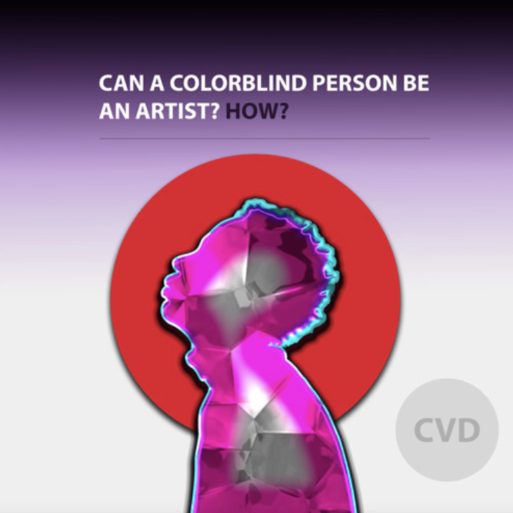
Colour Blindness in Design
source: https://www.aoa.org
Did you know that 1 in 12 men and 1 in 200 of women worldwide are colour blind? If you have students who have this condition and wants to pursue a career in design, there are tons of information that you can share with them to make their journey easier, visit the website below for further information:
Colour Blindness should also be one of the considerations when designing visuals and making colour choices.
Here are some design tips to consider to make your design inclusive:
Many color blind individuals can’t perceive red, which is often used for danger. Consider incorporating textual or shape cues to reinforce the message.
Color blind individuals struggle with certain hues but can discern differences in saturation and shade. This influences how you blend marketing colors.You can avoid fully saturated complementary colors like red-green. Instead, use lighter shades for better differentiation.
Adding texture to similar colors helps, especially in charts and graphs. Consider using a different tone or adding a border.
Other helpful websites about Color blindness in Design
How To Use Color Blind Friendly Palettes in Your Design – https://venngage.com/blog/color-blind-friendly-palette/
A Designer’s Guide for the Color Blind – https://medium.com/kubo/seeing-the-unseen-a-designers-guide-for-the-color-blind-8a6da64fe14c
Technical References
Although design softwares, such as Adobe Indesign or open source ones like Affinity Publisher or Gimp can be an option to complete the suggested learning outcomes for this lesson, there are a lot of resourceful ways for your students to complete the activity. The important thing is the actual application of the concepts that is taught. Here are a few suggestions:
Hand drawn Illustration
Collage or cutting and pasting of illustrations or photos from magazines or newspapers
Read/Watch 1. Watch this video to learn more about the basics of using color in graphic design
In this video, you will learn about the color wheel and color harmony concepts, which are crucial for selecting colors that are visually pleasing, coherent, and impactful, resulting in an effective design. Additionally, the video covers common color mistakes and provides instructions on how to choose the right color and find inspiration.
2. Read this blog to learn more about colour psychology https://visme.co/blog/color-psychology-in-marketing-the-ultimate-guide/
Color tools for color palette, schemes, combinations and even gradients https://www.sitejet.io/en/article/15-of-the-best-color-tools-for-designers
Color Tools And Resources https://www.smashingmagazine.com/2021/07/color-tools-resources/
13 Useful Resources for Color Palette Inspiration https://glorify.com/learn/10-helpful-resources-for-color-palette-inspiration
Reflection and guiding questions
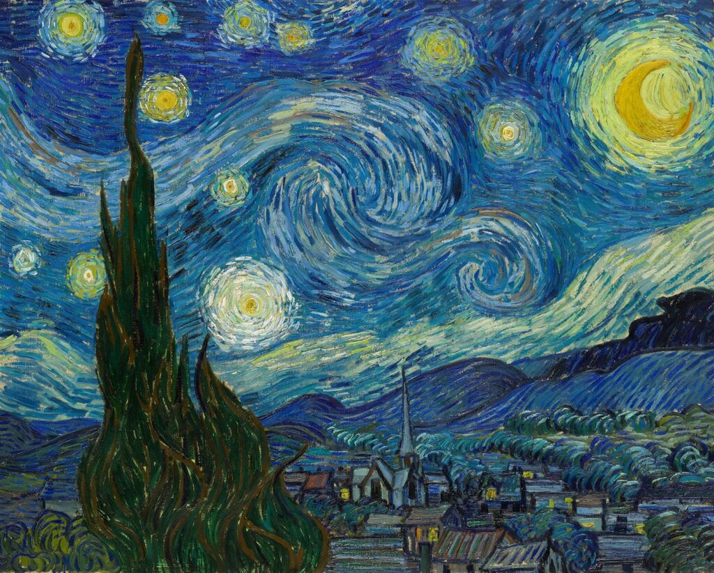
The Starry night by Vincent Van Gogh
Find one well-known Painting or Take a look at the brand logos of well-known brands. Try to identify the colors used by the designer or artist.
Here are a few guiding questions to help your students reflect on their observations: – What colors did the artist or designer use? – Can you identify the color scheme used by the designer or artist? – Based on the lesson about color psychology, why do you think they used that particular color combination? – What emotions or reactions do you think the artist or designer is trying to evoke?
Learning Activities to support this lesson
When teaching secondary students about colour in graphic design, it’s important to engage them actively and creatively. Here are some activities you could consider:
Hands-on Colour Mixing: Provide students with paint or digital tools to physically mix colours and observe the results. This hands-on approach helps them understand the principles of colour theory firsthand.
Materials – Goauche paint, Poster Colour
Colour Wheel Exploration: Have students create their version of the colour wheel, either digitally or using physical materials. Encourage them to experiment with primary, secondary, and tertiary colours, and discuss the relationships between them.
Practical examples: Show students examples of effective graphic designs that use colour well. Analyze advertisements, posters, and other visual materials to identify how colour contributes to the overall message and impact.
Materials – Magazines, Websites, actual samples of posters, flyers, brochures
Colour Psychology Discussions: Discuss the psychological effects of different colours and how they can influence perception and mood. Encourage students to consider the emotional impact of colour choices in their designs.
Technology Integration: Integrate digital tools such as graphic design software or online colour palette generators into the curriculum. This allows students to explore colour theory concepts in a contemporary context and develop practical skills for digital design.
By incorporating a variety of instructional strategies, you can create a dynamic and engaging learning experience that effectively teaches secondary students about colour in graphic design.
Typography is the skillful arrangement of text to create a visually pleasing and easy-to-read composition, serving as a fundamental component of design. Designers utilize typography to organize typefaces within a user interface, ensuring readability, scalability, and aesthetic appeal. Effective typography enhances a product’s visual appeal, improves user-friendliness, and positively impacts brand perception.
Typography is fundamental to every form of design, and choosing the right typeface and font is critical to the success of any project. While you may excel in colour selection, creating balanced layouts, and perfecting composition, neglecting font choice can undermine all your efforts and hinder your objectives.
Reflecting on my early days as a designer, I recall how typography often took a backseat in my process. Many designers, especially beginners, tend to prioritize visuals and imagery over typography. However, this shouldn’t be the case. The ability to select the right typeface and font is a skill in itself, as not all fonts are created equal, as the saying goes.
To delve into this topic, let’s explore common typographical terms and discuss strategies for selecting and pairing fonts. By continuously experimenting and learning, we uncover one of the most crucial aspects of design: typography.
Lesson Outline
Definitions and terms
How to select and combine Typefaces
Other relevant terminologies to remember
Use and application of typography
Inclusive typography
IndigenousTypography
Technical References
Reflection and guiding questions
Suggested Learning Activities to support this lesson
Learning outcomes:
At the end of the lesson educators shall be able to teach their students to:
• Recognize how typography affects readability, scalability, aesthetics, and brand perception, and how effective typography enhances product visuals and user-friendliness.
• Identify key typographical terms and their importance in text appearance and readability, including typeface, font, size, weight, width, italics, kerning, tracking, leading, and hierarchy.
• Explore typeface classifications and variations. Identify and explain uses for serif, sans-serif, and display fonts. Recognize variations within typefaces, such as size, weight, width, and italics, and explain their impact on text presentation.
• Learn how to effectively utilize typography to enhance brand recognition, user engagement, and decision-making. Acquire strategies for organizing elements, establishing hierarchies, and guiding reader attention through font selection.
• Apply typography principles in design: Implement best practices for combining and pairing typefaces to create visually appealing compositions. Develop practical skills in selecting fonts tailored to specific design purposes, considering tone, readability, and legibility.
• Develop critical thinking and design skills: Analyze and evaluate typography’s effectiveness in diverse design contexts. Apply knowledge and skills to make informed decisions regarding font selection and typography in design projects.
Definitions and terms
Typeface VS Fonts
The distinction between font and typeface lies in their relationship. A typeface encompasses a set of characters with a shared design, like Helvetica. However, within the typeface, there are different fonts, each varying in weight, style, and size, such as Helvetica Regular in a specific size.
Typeface
Typeface encompasses the entire family of fonts, each varying in size and weight. Confusion often arises because it is often used interchangeably with the word font. While this might not be a major concern it matters especially when discussing design projects. For instance you’d have to communicate to someone about the font used, you will likely seek specific details, such as the exact font like “Roboto Medium 9 point,” rather than just the typeface “Roboto.”
Therefore, what we commonly call a font is typically a typeface, such as Times New Roman or Montserrat.
There are several different typeface classifications, including:
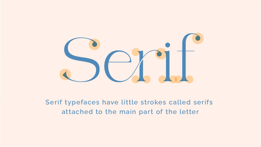
Serif – Serif typefaces feature small lines or embellishments at the ends of letter strokes, whereas sans-serif fonts lack these additions. Serif examples include Times New Roman, Georgia, and Baskerville, while sans-serif examples include Arial, Helvetica, and Calibri.
Examples of Serif typefaces
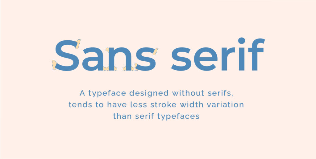
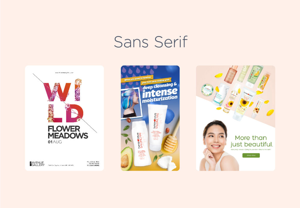
San Serif – Sans serif typefaces are viewed as more contemporary compared to serif typefaces. They lack the distinguishing strokes of serif typefaces, hence the use of the French word “sans,” meaning “without.” Sans serif typefaces are frequently chosen to convey cleanliness, minimalism, friendliness, or modernity.
Examples of Sans Serif typefaces
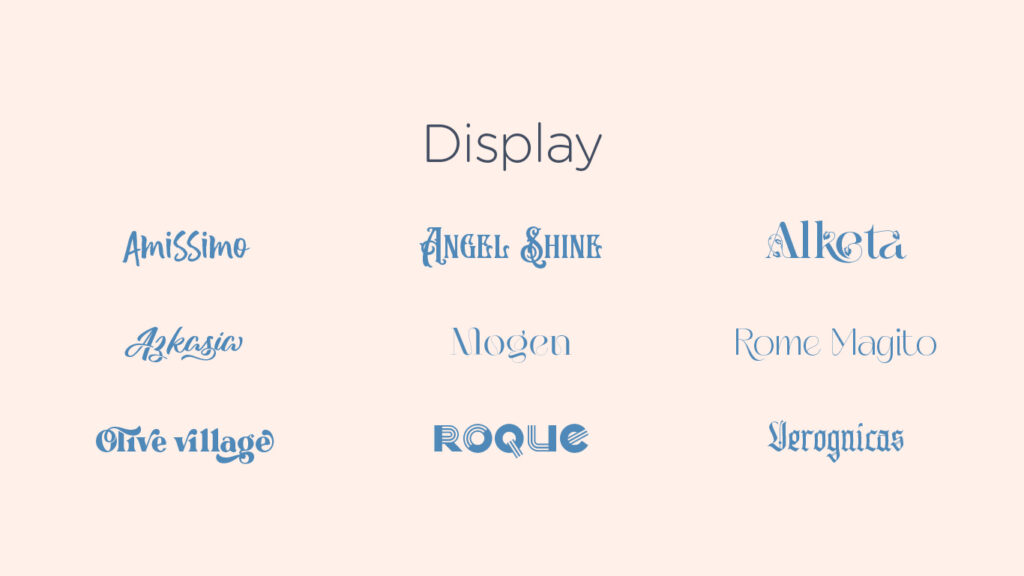
Display Typefaces – Display typefaces come in various styles, such as script, blackletter, all caps, and decorative variants. They are best used for limited text, such as titles, headers, and designs that need a strong visual emphasis. Display fonts are ornamental and not intended for use as body text.
Examples of Display typefaces
What is a font?
A font provides a more precise definition of the text style by specifying both its size and weight within a typeface. For instance, consider the typeface Helvetica Neue:
• Helvetica is a typeface • Helvetica Regular and Helvetica Bold are two distinct fonts under the typeface Helvetica
Here are ways that fonts of the same typeface can vary from one another:
Size – Font size is the height of a typeface and is measured in points, where one point equals 1/72nd of an inch. It determines the visual prominence of text on digital platforms like computers and websites. Technically, a font in two different sizes are different, even when the typeface is identical. That’s right—Gotham 12 pt and Gotham 16 pt are two distinct fonts.
Weight – Weight refers to the thickness of a typeface’s stroke in a particular font. While regular and bold are commonly known weights, the range can extend from very light to very heavy.
Letterform width – Spacing further highlights the difference between typefaces versus fonts. There’s a whole range of letterform widths: compressed, condensed, semi-condensed, narrow, normal, extended, extra extended, and expanded. Just like font weights, different widths indicate different fonts.
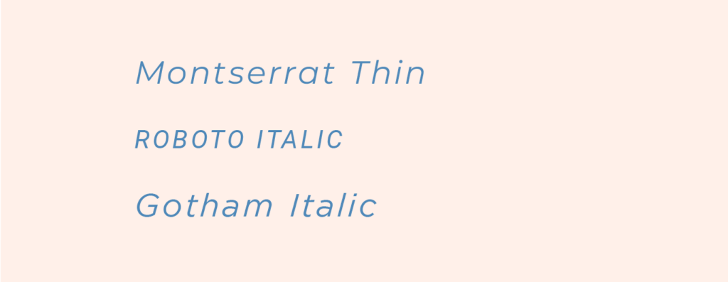
Italics – Italic is a font style characterized by a slanted appearance to the right. It’s commonly utilized by writers to emphasize specific words or phrases. Additionally, it can denote a character’s speech or highlight stressed words. Italic type is also suitable for foreign language words or the titles of longer works such as novels or films.
How to select and combine fonts
When to use Serif Fonts Serif fonts are often chosen for their authoritative and professional appearance, suggesting a sense of history or experience. They are reminiscent of typewriters and are still used by longstanding institutions like The New York Times. These fonts can give a vintage feel and are used to evoke earlier eras. Additionally, serif fonts enhance legibility, especially in small text sizes, making them ideal for body copy in printed materials.
When to use Sans Serif Fonts Sans-serif fonts are typically associated with modern typefaces, with Futura being one of the first popular sans-serif fonts, followed by Helvetica. Sans-serif fonts are often preferred for situations where space is limited, such as signs, apps, and map labels. However, certain sans-serif fonts, like Arial and Helvetica, are also suitable for longer passages of text known as body copy, although there are some exceptions.
When to use Display Fonts The primary purpose of this typeface is aesthetics rather than readability, making it commonly used in brand names, logos, and short titles. Decorative typefaces are ideal for expressing additional personality, emotion, and uniqueness through font selection.
Font Selection Best Practices:
Identify Purpose and Message – Determine the intended use of the font. Select a typeface that reflects the desired message and tone.
Prioritize Legibility – Choose a body font that is easy to read and legible.
Effective Pairing – Avoid pairing similar fonts; opt for complementary styles like pairing a Sans Serif with a Serif font. Experiment with tracking to alter font appearance.
Understand Typeface Usage – Understand the appropriate usage scenarios for the selected typeface. Tailor font choice to match the message being conveyed.
Simplicity and Clarity -Limit the number of fonts used per project; aim for two fonts for clarity.
Organization for Efficiency – Create a collection of typefaces categorized by suitability and industry. Maintain collections for headline, subheading, and body copy fonts, and categorize fonts based on industry suitability for efficient access and use.
Other relevant terminologies to remember
Kerning – Kerning refers to the spacing between letters or characters. Adequate kerning ensures that letters or characters don’t appear too close together. Insufficient kerning can lead to misinterpretation of text by readers.
Tracking – The adjustment of spacing between letters is known as tracking or letter spacing. Typically, positive tracking is applied to create a more open and spacious layout. As text size increases, letter spacing also increases, necessitating a decrease in tracking. Conversely, for smaller text sizes, tracking needs to be increased.
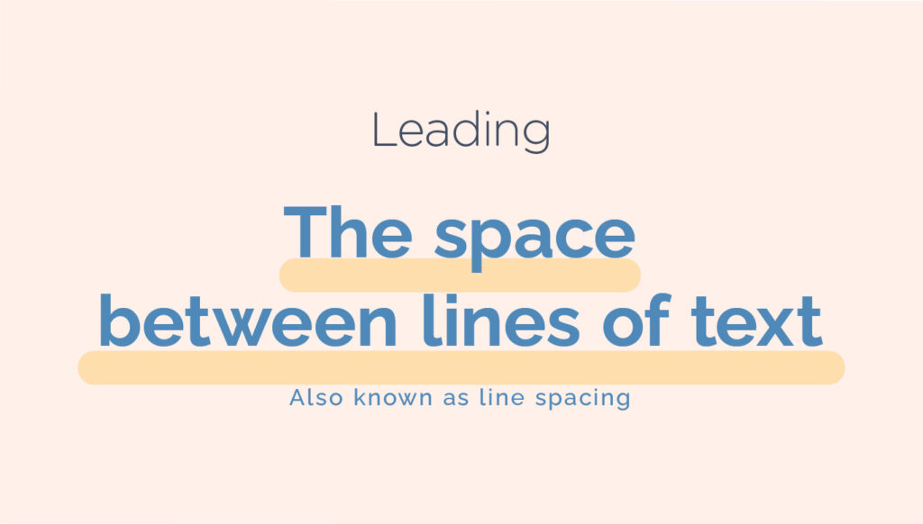
Leading – The space between two lines of text is referred to as line spacing or leading. By adjusting the leading of a paragraph, we can add visual appeal and establish hierarchy.
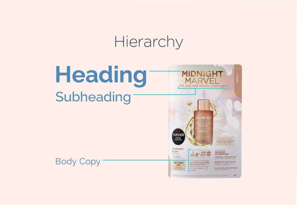
Hierarchy – Hierarchy guides readers by using different levels of emphasis to show them where to start and where to go next. To establish hierarchy, make the most important items stand out by using larger, bolder, or different styles. Keeping it simple with just a few complementary styles is key.
Use and application of Typography principles
Here are a few examples of design output where effective font selection and pairing are put into practice:
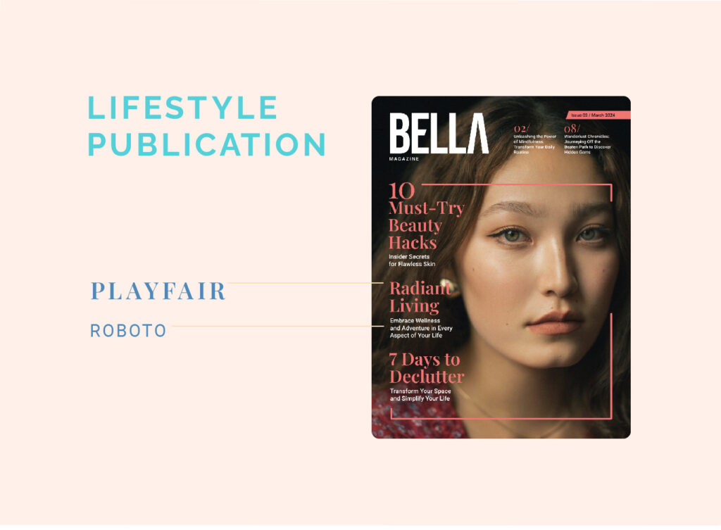
Magazine Cover – Display Typeface for the Magazine Title, Serif font for the headers and Sans serif font for the short description of the articles
Menu – Display Typeface for the header and simple sans serif for the body copy
Fashion Poster – Bold Serif font to highlight the promotion and thin sans serif for the details
Inclusive Typography
We can educate our students to design with empathy, promoting inclusivity and accessibility in their designs. Similarly, as educators, we can tailor our learning resources to create an inclusive and welcoming environment for all learners.
By teaching aspiring designers to be able to carefully choose the right font, we can make sure that everyone, regardless of their neurodiversity, can access and benefit from the material.
Here are ways where we can practice inclusivity and empathy through typography:
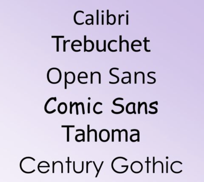
Research shows that fonts with more natural and easy-to-read shapes, like those with unique forms for letters like ‘b’ and ‘d’, such as Century Gothic, Trebuchet, Calibri, Open Sans, and Tahoma, can be helpful for individuals with dyslexia.
2. Fonts with small decorative strokes, known as serifs, can be harder to read for neurodiverse people. They tend to prefer simpler, sans-serif fonts like Arial. Roboto or Helvetica which have cleaner lines and shapes.
3. Some individuals with neurodiverse conditions may find fonts that resemble handwriting, such as Comic Sans, appealing. However, these fonts can cause confusion between certain letter combinations. Fonts where each character occupies the same amount of space, such as Consolas or Courier New, are more suitable for neurodiverse readers as they can minimize confusion between letters.
4. Specific fonts, like Open Dyslexic and Dyslexie, are designed to be easier for dyslexic individuals to read.
5. The size of letters, especially the parts that stick up or down (called ascenders and descenders), is also important. Since dyslexic readers often rely on recognizing the shapes of words, shorter ascenders and descenders can make words harder to decipher and slow down reading.
6. Text size matters as well. Neurodivergent individuals should be able to adjust text size to suit their needs. Having a line spacing of at least 1.2 and sometimes increasing the space between characters can make reading easier for neurodivergent students.
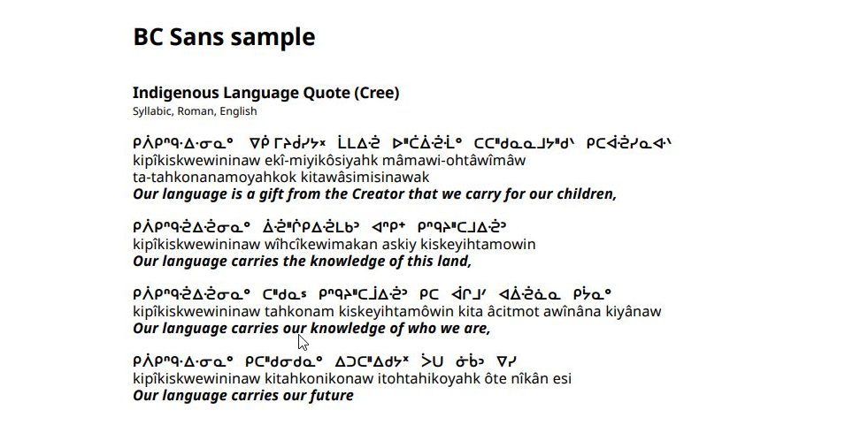
Did you know that the province of British Columbia has its own custom typeface? BC Sans (2.0) is an open-source font created specifically for government use to enhance the legibility and accessibility of digital services. It was crafted to accommodate unique characters and syllabics present in Indigenous languages within British Columbia. BC Sans is mandated for implementation across all existing and future government webpages on gov.bc.ca, as well as on government services not hosted within the gov.bc.ca domain.
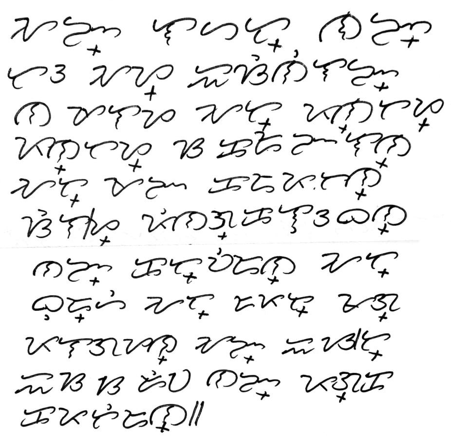
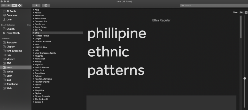
Similarly, The Philippines also have their own indigenous script called Baybayin, also previously referred to as alibata. It falls under the category of Brahmic scripts, specifically an abugida. Historically, it was extensively utilized in Luzon and various regions across the Philippines from the 16th to the 17th centuries until it was supplanted by the Latin alphabet during the era of Spanish colonization.
Efforts to promote Baybayin, the indigenous script of the Philippines, are gaining momentum nationwide. The National Museum and Commission on Culture and Arts have dedicated spaces to display various written forms of the script. In previous congressional sessions, the House of Representatives took steps to revive Baybayin and other traditional writing systems, aiming to promote, protect, and preserve them as vital cultural assets. The Department of Education and the Commission on Higher Education have likewise incorporated Baybayin into their educational curricula, ensuring that students learn about its historical and cultural importance.
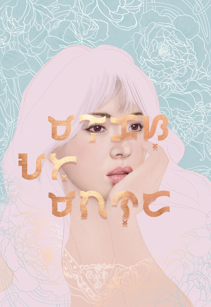
A digital art I made with the Babybayin inscription meaning Malakas at Maganda (Strong and Beautiful)
Technical Resources
Although it is best to have industry recommended software to practice typography, softwares like Microsoft word or any word processing software can be used as well. Newspapers and Magazines and anything with printed words can also be useful tools for students to appreciate the art of typography.
Below are a few useful resources that you and your students can check out:
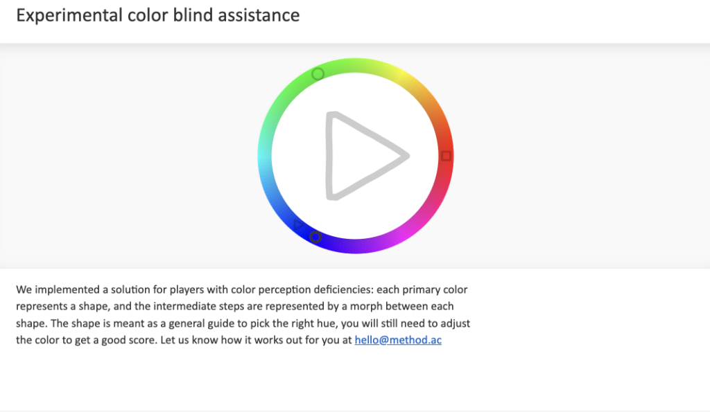
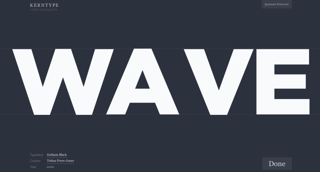
Kerning and Tracking game – This is a fun game that can provide students with an opportunity to practice identifying the optimal spacing between characters. The objective of the game is to attain text that is both readable and visually pleasing.
Link – https://type.method.ac
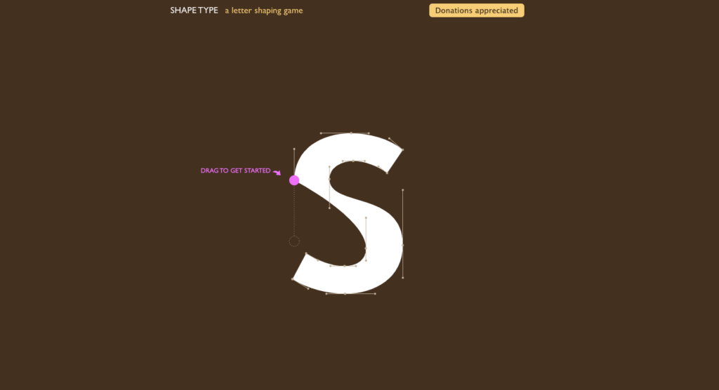
2. Shape type game – Shape Type is an HTML5 typography game where players must utilize curve-adjustment tools to refine letterforms across different font styles. The more accurately you match the letter’s shape, the higher your score will be.
Link – https://shape.method.ac
Read/Watch
1. Watch this video to learn more about the basics of typography This video covers key aspects of typography, including using and combining different fonts to enhance visual impact, avoiding fonts that compromise design integrity, and explaining typography terminology like hierarchy, leading, tracking, and kerning.
2. Read these blogs to learn more about Typography in graphic design and font pairing:
• Why Is Typography Important in Graphic Design? – https://www.flux-academy.com/blog/why-is-typography-important-in-graphic-design#:~:text=Typography%20has%20two%20main%20purposes,and%20easy%20on%20the%20eyes
• How to combine fonts – rules, tips and tricks –https://sketchdeck.com/blog/combining-fonts/
• 5 Common Typography Applications and Use Cases (and How To Design for Them) – https://www.andacademy.com/resources/blog/graphic-design/common-typography-applications/
Reflection and guiding questions
Typography is a powerful communicator; it establishes tone and pervades our surroundings, from signage to street signs. It holds the ability to shape the identity of spaces and even entire cities. Consider iconic examples like “I heart New York” or the typography of the London subway system.
Ask your students to capture photographs of fonts they admire while exploring their neighborhoods, downtown areas, or even within your school. Prompt them to document at least five distinct typefaces. To further explore their choices, consider asking these questions such as:
1. What drew you to this particular font? How does it complement its surroundings? What is the tone of the font?
2. What characteristics of the font that you particular like? Is it a serif, a sans serif or a display font?
3. Think about what kind of businesses or places the font might fit best. Do you think it’s being used in the right way, or could it work better somewhere else? How flexible do you think this font is for different situations?
4. Ask students to find out the name of the font and do a bit of digging into its history
5. Consider what feelings or vibes the font gives off to people who see it. Does it grab your attention, feel understated, or make you curious about something?
Encouraging thoughtful reflection can deepen their appreciation for typography.
Suggested Learning Activities to support this lesson
Design your own typefaces – Encourage your students to create their own fonts using various methods. They can opt for freehand illustration on graphing paper or utilize online platforms like FontStruct. Through FontStruct, students can effortlessly design a comprehensive alphabet for downloading and practical use.
2. Creative word play – One interesting creative exercise is to compile a list of words and ask each student to choose one from the list. The task is to create an illustration that represents the meaning of the chosen word through typography. This exercise can be done digitally, by sketching, or by copying illustrations from magazines. The objective is to craft the typography in a way that visually reflects the meaning of the word itself.
3. Encourage students to have their own typeface collection in order to streamline the design process and save time. By listing and organizing fonts suitable for different text types – such as headlines, subheadings, and body copy – they can easily find the right options. Additionally, it is helpful to categorize fonts by industry; for instance, formal fonts would be suitable for Real Estate, Banking, and Insurance, while others may be more fitting for retail, restaurants, or resorts. Having these collections organized and readily available can greatly facilitate a designer’s work.