The fundamentals of design such as lines, shapes, textures, and balance, are ubiquitous in visual creations. They serve as the foundation for all visual content. Initially, these basics may seem daunting, especially if you don’t consider yourself a designer.
However, understanding these fundamentals is simply about grasping each component and leveraging it effectively. This knowledge is invaluable for various projects, whether you’re crafting graphics or enhancing designs. It’s essential for designers, regardless of their experience level, to comprehend how design elements and principles interact and to apply them purposefully in their projects to achieve visually appealing and functional result.
Lesson Outline
- Definition and terms with samples on how to implement the fundamentals of design to enhance your designs.
- Technical References
- Suggested Learning Activities
Learning Outcomes
At the end of the lesson educators shall be able to teach their students to:
- Develop a thorough understanding of the fundamental elements of design, such lines, shapes, textures, and balance, and their significance in visual compositions.
- Gain proficiency in applying design fundamentals to enhance the aesthetic appeal and functionality of various design projects.
- Engage in learning activities aimed at practicing and reinforcing the application of design fundamentals in real-world design scenarios.
- Cultivate the ability to recognize and analyze how design elements and principles interact within visual compositions, facilitating intentional and purposeful design decisions.
- Develop creative problem-solving skills through the application of design fundamentals to address design challenges effectively.
Definition and terms
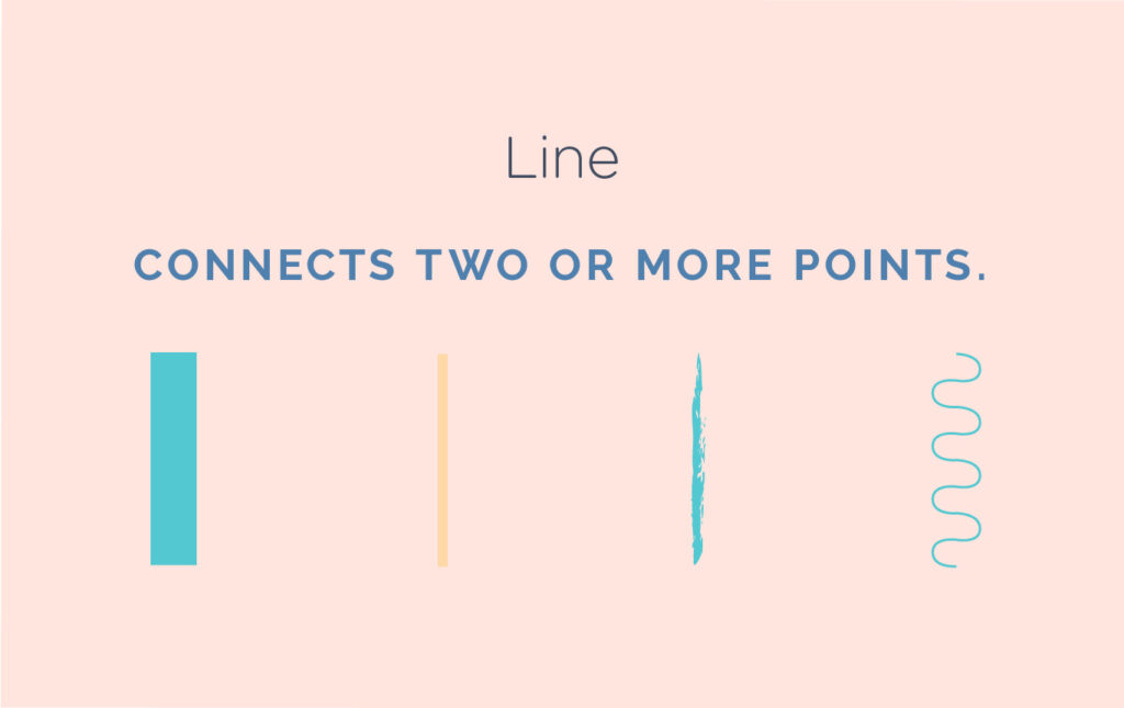
- Line – A line is a connection between two or more points. They can vary in thickness, waviness, or jaggedness. Lines are often found in design, in drawings, illustrations, infographics, maps, and graphic elements like icons, textures and patterns. They are also used in simpler compositions to add emphasis, to organize and add appeal. When working with lines, consider its characteristics such as weight, color, texture, and style, as these subtle variations significantly influence design perception and their purpose. Explore how lines manifest in unexpected places, such as within text, where experimenting with different qualities can yield diverse outcomes.
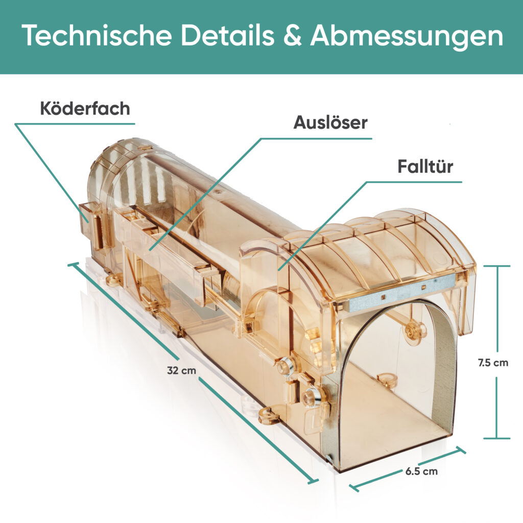
In the example below, Lines are used to point the important parts of the product.
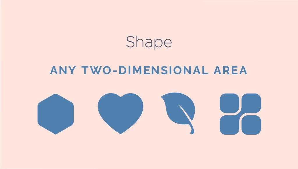
2. Shape – Shapes are two-dimensional forms that are closed areas with defined length and width. They can take various forms such as circles, squares, and triangles, and are categorized into two main types: geometric and organic. Geometric shapes are characterized by regularity, while organic shapes exhibit fluid contours. Artists and designers use shapes as foundational components in rendering images visually and conceptually. By applying shading techniques, shapes can be imbued with the illusion of depth, making them resemble their three-dimensional counterparts and forms.
Shapes are essential in visual communication as they help recognize symbols from street signs, abstract art, and other images.
In everyday design, shapes are essential for organizing content, creating illustrations, and enhancing visuals. They form the basis of various elements and hold significant importance.
In the example provided below, I utilized a variety of shapes to highlight and depict relevant data:

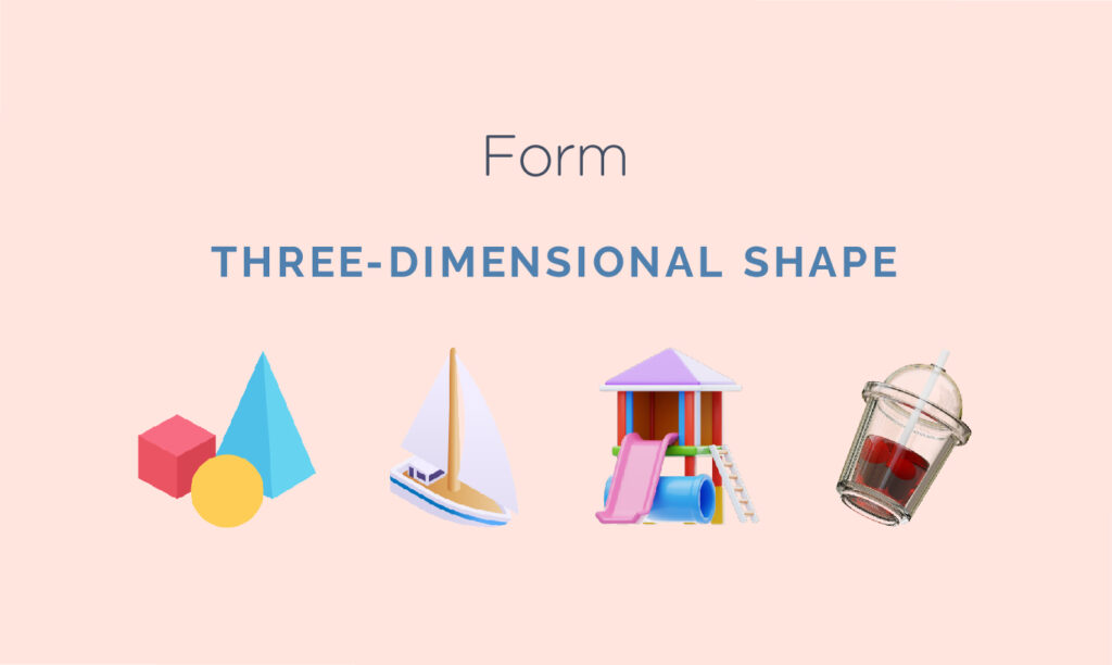
3. Form – When a shape becomes three dimensional, it is known as form. Forms are present in sculptures, architectural structures, and various three-dimensional objects. Forms can also be suggested through artistic techniques, utilizing elements such as light, shadow, and perspective to create a sense of depth.
Even in less realistic forms such as illustrations, artists use similar techniques to give the impression of depth. A simple shadow can create the illusion of layers or provide context to an object by giving it a sense of spatial placement.
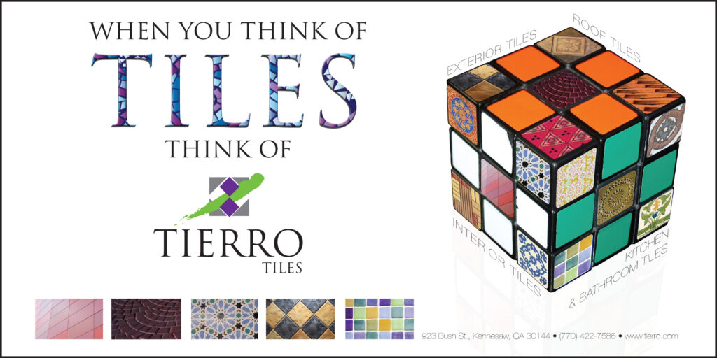
In the example below, a Rubik’s Cube was used to suggest a mix-and-match approach when selecting tiles for your home.
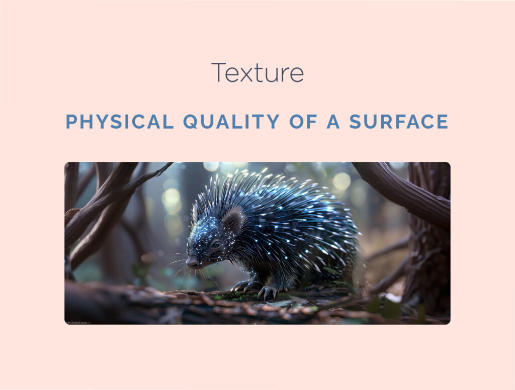
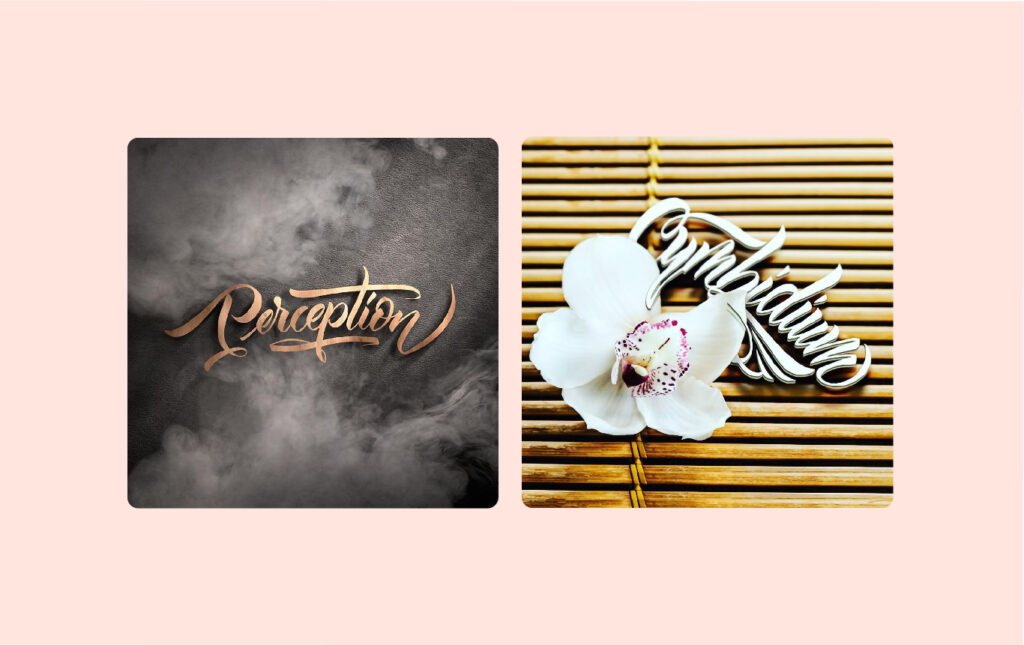
4. Texture – Texture pertains to the tactile quality of a surface. It can be an integral part of a three-dimensional object. In design, texture adds depth and tactile sensation to otherwise flat visuals. Surfaces may convey smoothness, roughness, hardness, or softness, depending on various elements at play. Textures make excellent background elements and add considerable intrigue to creative endeavors. However, it is important to exercise caution to avoid excessive texture as it can quickly overwhelm the viewer.
In the sample poster below promoting a sports tryout event, the background resembles a grass texture of a sports field, subtly evoking the theme of athleticism and sportiness:

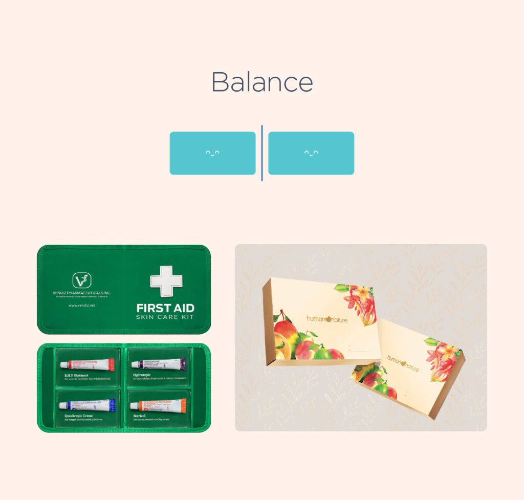
5. Balance – Balance in design refers to the equal distribution of visual weight, which can be influenced by various factors such as color, size, quantity, and negative space. Achieving a balanced composition can be challenging for beginners, as it relies heavily on intuition.
Symmetrical designs are characterized by the presence of identical or similar elements on both sides of an axis, creating a sense of balance and harmony through uniformity. On the other hand, asymmetrical designs use different elements to create a balanced composition, without necessarily maintaining perfect symmetry. This is achieved by strategically placing contrasting elements to draw attention to focal points, resulting in an overall sense of balance and visual interest.
6. Rule of thirds – Many designers and photographers use a technique called the rule of thirds. This method involves dividing the workspace into a 3×3 grid and placing the focal point on or near one of the grid lines. This creates a visually pleasing composition that is easy for the human eye to follow. Research suggests that people naturally follow this orientation when viewing a design.
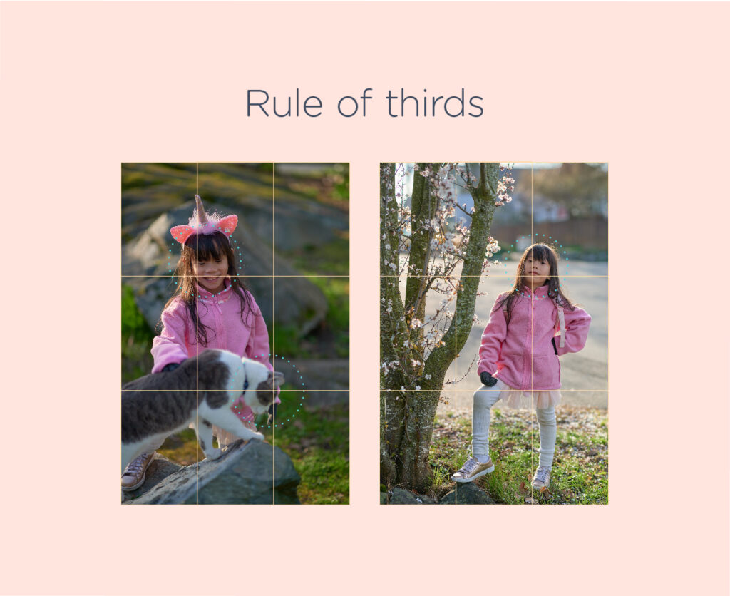
In the example below, the product is strategically positioned at one of the intersection points of the grid, ensuring that viewers are immediately drawn to it.

Technical References
- Read this blog to learn more about The meaning of shapes in design
- Read this blog to learn about the elements of design
- To create shapes, lines, and forms, you’ll need vector graphic tools. While Illustrator is widely accepted in the industry, there are also other open-source and affordable alternatives available for you and your students to explore and practice creating vector graphics.
• The 6 Best Adobe Illustrator Free Alternatives
• Illustrator Alternatives: Free or Cheap Vector Graphics Tools
Suggested Learning Activities
Create Icons – Using what they have learned about the fundamentals of design ask your students to create an icon. Icons are images that visually represent individuals, locations, or objects. Unlike pictograms or symbols, they are more realistic and need to closely resemble their subject to be universally understood. Icons are often used on signage, mobile devices, the internet, and in places where instructions or information needs to be communicated without the use of words.
No software is required; a graphing notebook or pad and pen will suffice. Utilizing their understanding of color, instruct them to add meaning through coloring.
Helpful Readings:
• 6 Easy Steps To Better Icon Design
• Icon Design: A Beginner’s Guide [+ Resources]
Leave a Reply
You must be logged in to post a comment.