Layout and composition are essential components of design that provide a structure to your work and enable easy navigation. They guide the viewer from the margins to the main content. Composition is important as it determines how your content is organized. Whether it involves text, images, or graphic elements, having a well composed layout is crucial for coherence in your work. Without it, your work would lack organization and clarity. Oftentimes, designers who are just starting tend to focus on learning design software before they learn the basic principles and fundamentals of design. However, to become a great designer, one should prioritize learning the foundations first.
To become proficient in layout and composition, it is important to develop a designer’s mindset, which may sound intimidating but is actually achievable. There are seven key principles that can enhance your work and improve your design sensibilities. Remember to keep these principles in mind as you start your next project and strive to implement them effectively.
Seven fundamental principles of design
1. Proximity
2. Space
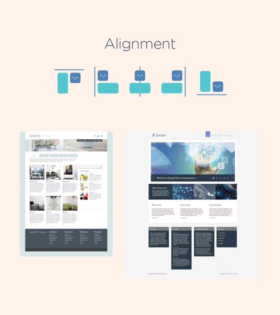
3. Alignment
4. Contrast
5. Repetition
6. Hierarchy
7. Colour
Lesson Outline
- Definition and terms with samples on how to implement the seven fundamental principles of design
- Technical References
- Suggested Learning Activities
Learning Outcomes
At the end of the lesson educators shall be able to teach their students to:
- Understand the importance of layout and composition in design, recognizing them as foundational elements that provide structure and facilitate navigation within visual compositions.
- Identify the significance of composition in organizing content, whether it involves text, images, or graphic elements, to ensure coherence and clarity in design work.
- Develop a designer’s mindset by familiarizing oneself with the seven key principles of design: proximity, space, alignment, contrast, repetition, hierarchy, and color.
- Apply the seven fundamental principles of design effectively in design projects to enhance visual appeal and improve design sensibilities.
Definition and terms
1. Proximity – Proximity is a design principle that aims to establish a visual relationship between related items in your content. It’s simple to apply as all you need to do is group items that are related, like text blocks, images or graphic elements, as shown in the example below.
This technique enhances the clarity of your work, whether it’s composed of text only or incorporates visual elements.
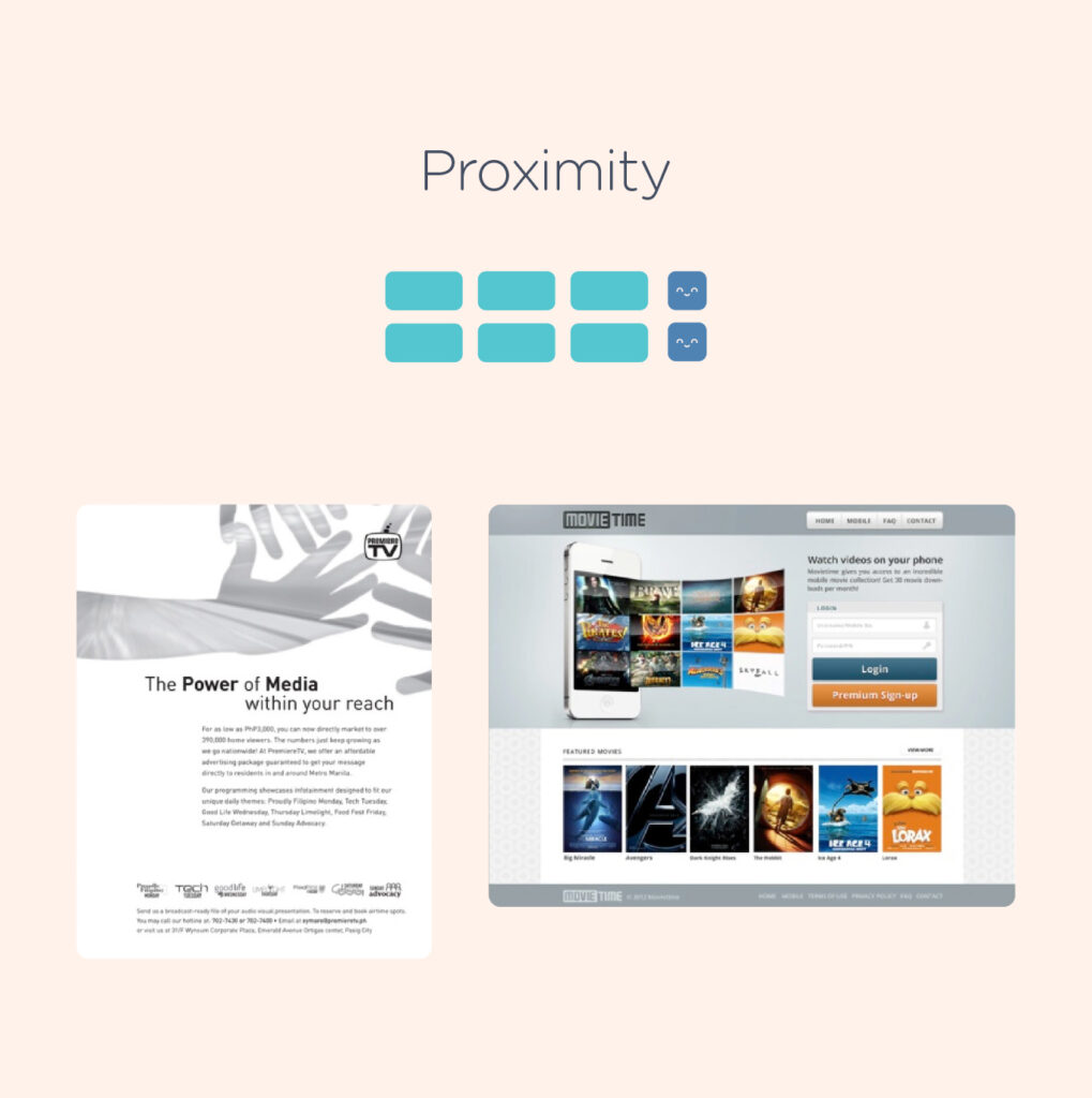
Below is another instance demonstrating the application of the proximity principle.
2. White Space – White space, also known as “negative space,” refers to the empty areas within a design that do not contain any elements. Novice designers often feel compelled to fill every pixel with some form of “design,” disregarding the significance of white space. However, white space has several crucial functions in a design, primarily allowing elements room to breathe. Additionally, negative space can accentuate specific content or parts of a design, enhancing clarity.
In addition, it aids in the legibility of elements within a design. For instance, typography becomes more readable when both upper and lowercase letters are used, as negative space varies more around lowercase letters, making it more readable.
In certain instances, negative space is used to create secondary images that may not be immediately discernible to viewers, contributing to branding strategies.
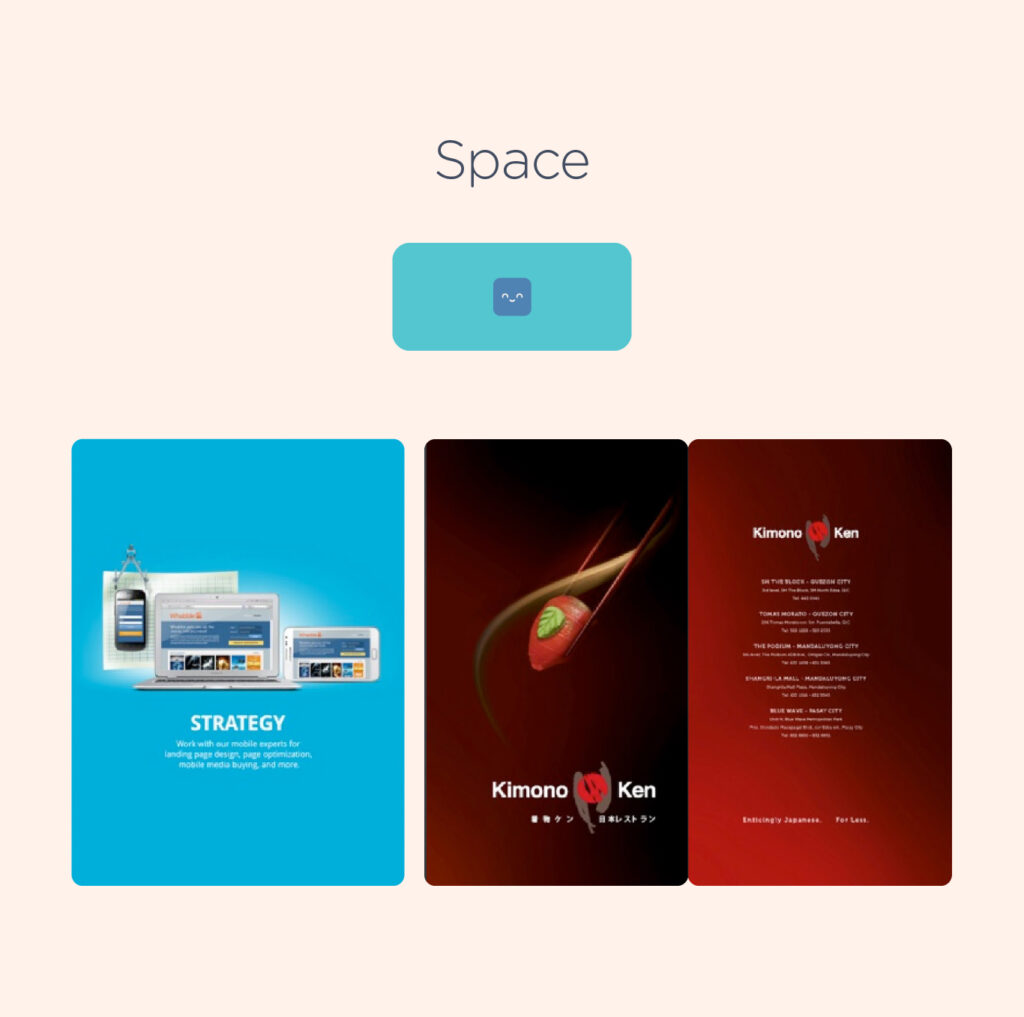
Below is another excellent demonstration of white space utilization:
3. Alignment – Alignment is an important concept that has an impact on various aspects of our daily tasks, even if we are not always aware of it. When we create emails or documents, text alignment is automatically applied. However, aligning objects such as images or text boxes can be difficult when done manually. It is important to maintain consistency to practice alignment.
Organizing content within a grid structure can help achieve proper alignment. Find a strong alignment that works for your design and stick with it, inconsistent alignment can make your design look disorganized.
4. Contrast – “Contrast” in design refers to the difference between adjacent elements. This difference in visual characteristics makes certain elements stand out and catches the attention of the viewer. Apart from this, contrast is also a crucial factor in making designs accessible. Insufficient contrast can make it difficult to read the text content, especially for those with visual impairments.
When a client say they wants a specific element to “pop”, it generally means that it needs more contrast from the other surrounding elements.
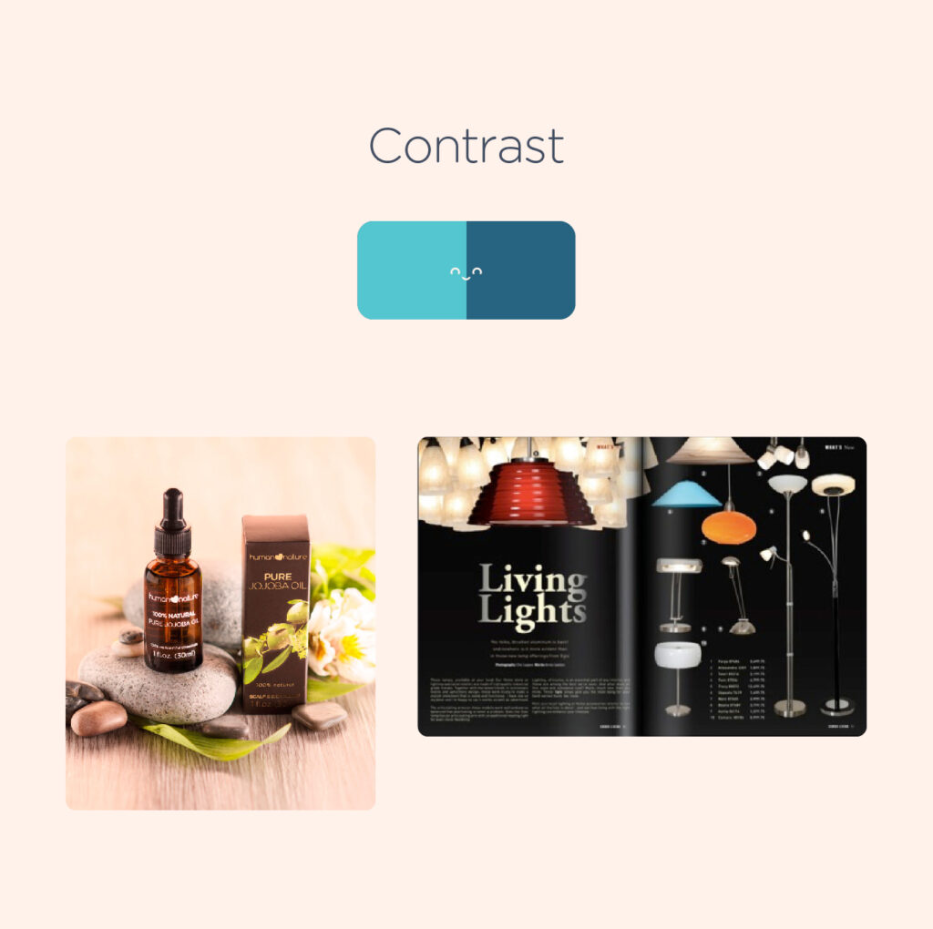
In the example below, the designer used a subtle gray font color and an accent to highlight the main ingredient of the product, making the actual photo of the product stand out.

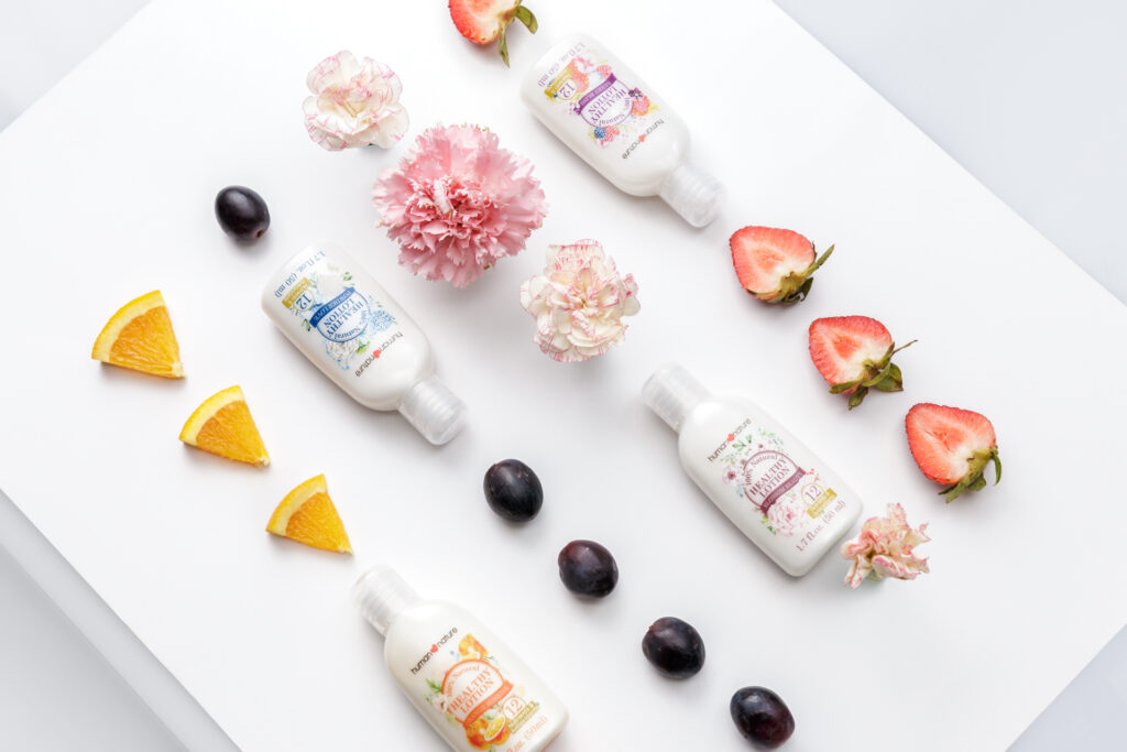
5. Repetition – Repetition can be an effective technique to reinforce an idea and create a cohesive design that combines various elements. It can be achieved by repeating colors, typefaces, shapes, or other design elements. Beyond reinforcing a concept, repetition can also contribute to establishing the overall look and feel of a design.
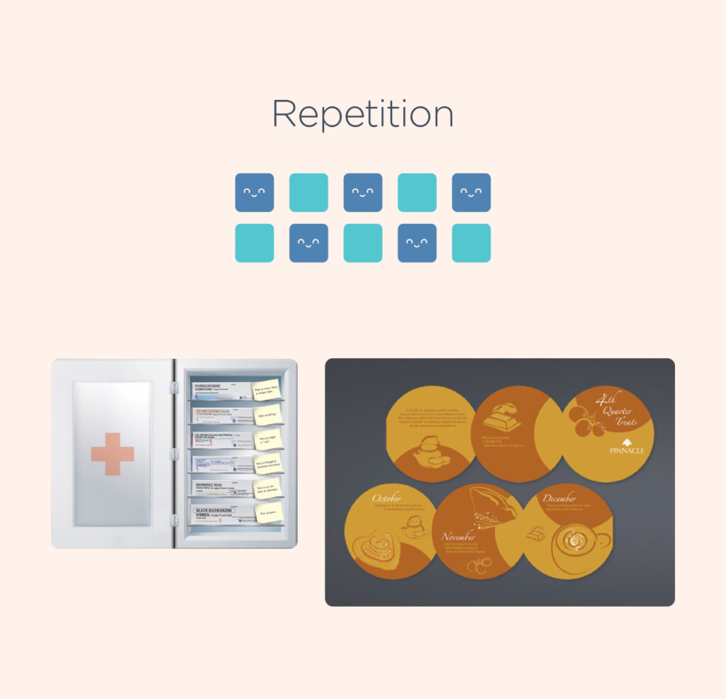
An example of product shot applying the principle of repetition.
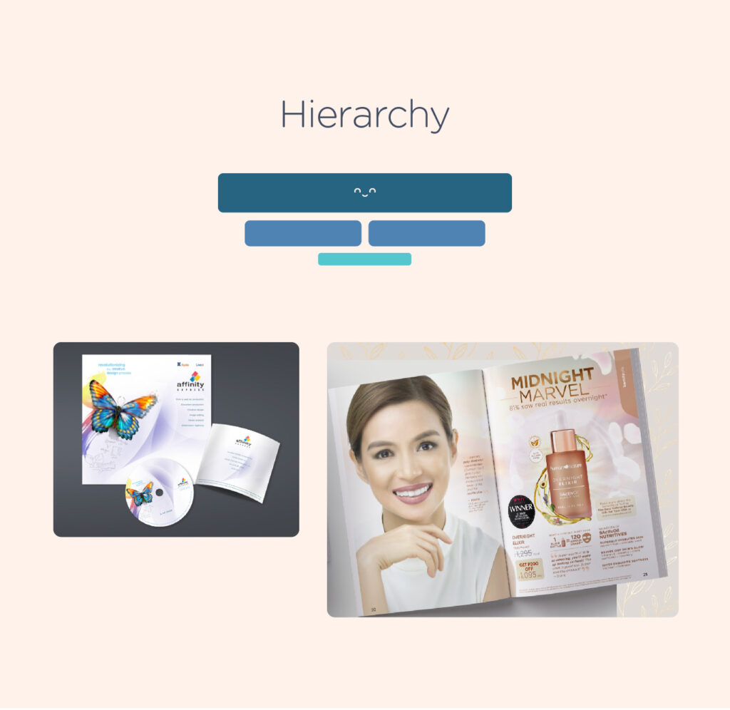
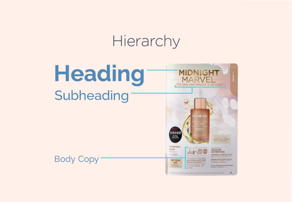
6. Hierarchy – Hierarchy in design refers to the relative importance of different elements within a layout. The important part of the content should be emphasized so that it appears to be the most significant.
One of the easiest ways to illustrate hierarchy in design is by using titles and headings. The page title should be given the most prominence, and be immediately recognizable as the most significant element on the page. Headings and subheadings need to be formatted in a way that highlights their importance to one another, as well as the title and the body copy.
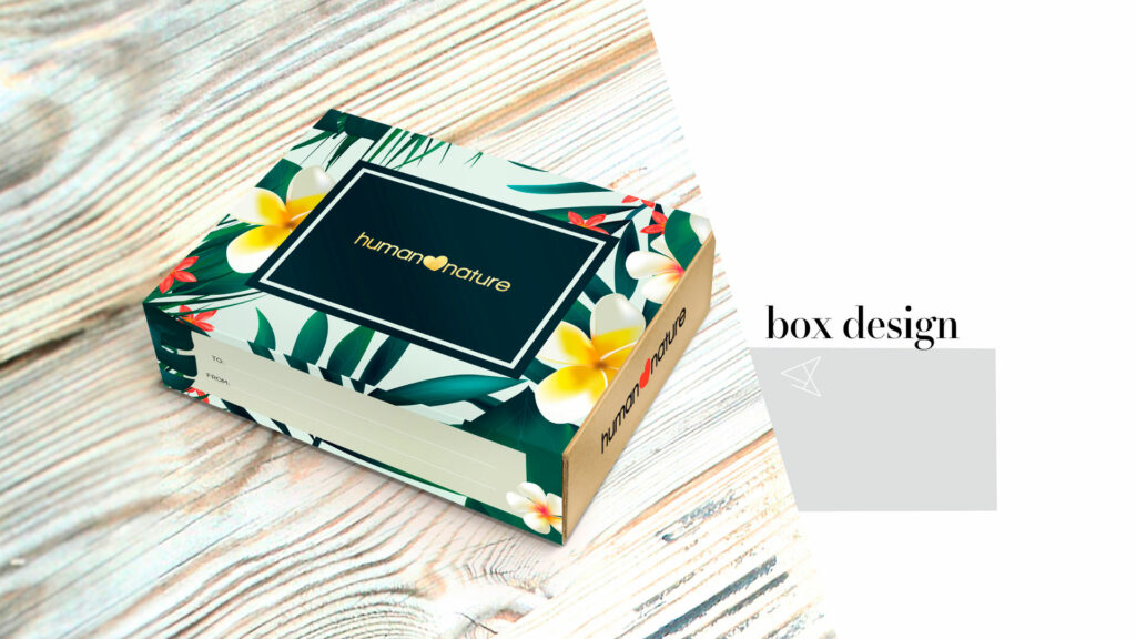
7. Colour – Learning the basics of color is essential before starting any design project. This includes understanding colour theory and psychology. Mastering the use of colour in design can help grab attention and make your work stand out.
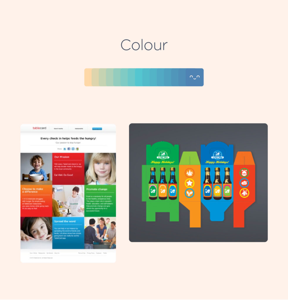
Packaging design featuring vibrant colors to evoke a tropical summer theme:
Technical References
Read/Watch
- Watch the video below to learn more about layout and composition.
2. Read – The Principles of Design and Their Importance
Suggested Learning Activities
Creating a layout using Magazine cut outs
- Provide students with magazine and instruct them to cut out various elements such as shapes, images, product shots, headlines, and body copy.
- Ask students to create an ad layout using the cutouts, utilizing their understanding of composition and design fundamentals.
- Encourage students to incorporate negative space strategically within the layout and experiment with multiple images, shapes, lines, and textures.
- Allow students to explore different orientations, such as vertical or horizontal.

Source – https://www.canva.com/learn/how-to-photo-collages-social-media-print/
Leave a Reply
You must be logged in to post a comment.