When it comes to design, the visuals and imagery you choose are extremely important. Whether it’s a stunning photograph or a carefully crafted illustration, they are often the first thing that catches the viewer’s eye. The use of imagery in design is crucial because it helps to communicate messages, emotions, and ideas, while also engaging the audience.
Images are not just decorative elements, they serve as a hook that draws viewers in, helping to establish a connection with them and leaving a lasting impression even before they have read a single word. As a designer, It is essential to know how to choose and format images appropriately to effectively communicate and connect with the audience.
In this lesson, we will be discussing the different types of images, namely Raster and Vector. I will be providing relevant sources of high-quality, royalty-free images that you or your students can use for their layouts, posters, and other design projects. I will also offer tips on how to select images and use them to their advantage.
Sometimes, design requirements may require the use of an illustration instead of an actual photograph, or converting a coloured image to black and white to make it more impactful. We will also cover image toning and cropping techniques to make your chosen images more effective. Additionally, we will talk about the use of AI-generated images as useful references.
Lesson Outline
- Definitions and Terms
- How to select your visuals effectively
- Colored or Black and White Image?
- How to crop your images
- Technical References
- Suggested Learning activities
Learning Outcomes
At the end of the lesson educators shall be able to teach their students to:
- Understand the importance of visuals and imagery in design, recognizing that designers are the initial point of engagement with the audience.
- Learn how to effectively use imagery to convey messages, evoke emotions, and communicate ideas in design projects.
- Recognize the difference between Raster and Vector images and their respective applications in design.
- Acquire the skill of selecting high-quality, royalty-free images suitable for various design projects.
- Gain insights into formatting images appropriately to enhance visual communication and audience engagement.
- Explore techniques for converting images between different formats and tones to meet design requirements effectively.
- Develop proficiency in image toning, cropping, and other editing techniques to optimize the impact of chosen images.
- Understand the potential of AI-generated images as design resources and references in the creative process.
Definitions and Terms
With countless digital images available for download and tons of software to created illustrations, picking the right file format for your project can feel daunting.
Raster VS Vector
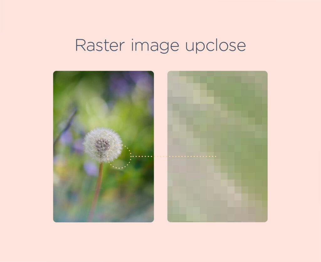
A raster image is a digital image that is made up of small, rectangular pixels arranged in a grid pattern to form an image.
The quality of an image depends on how high their resolution is, meaning the greater the resolution the better its quality. Resolution applies to both printed and digital images.
When selecting images, you may need to decide whether they will be displayed on a screen or printed. If your design will be displayed on a screen, such as a website, you only need to consider the screen resolution. To ensure the images in your document look good on a screen, you should make sure they are in 72 PPI resolution. On the other hand, if you plan to print your design output, you need to make sure that the images are 300 DPI in size at 100% of the final output. This will ensure that your images look clear and sharp when printed.
Many kinds of resolution can apply to different media, but let’s just narrow it into two types, print resolution and screen resolution.
Screen Resolution
Screen resolution is measured in PPI (pixels per inch). The optimal on-screen image resolution is 72 DPI. Increasing DPI won’t improve image quality, but will enlarge file size and slow website or file loading.
Print Resolution
Print resolution is measured in DPI, which is the number of ink dots a printer deposits per inch. 300 DPI is the standard print resolution for high-quality output, meaning that the printer outputs 300 tiny ink dots per inch of the print.
A sample of a raster image and how it looks up close.
Below are the common raster file formats
• JPG (Joint Photographic Expert Group)
• PNG (Portable Network Graphic)
• BMP (Bitmap Image File)
• TIFF (Tagged Image File Format)
• PSD (Adobe Photoshop Document)
• PDF (Portable Document Format)
• GIF (Graphics Interchange Format)
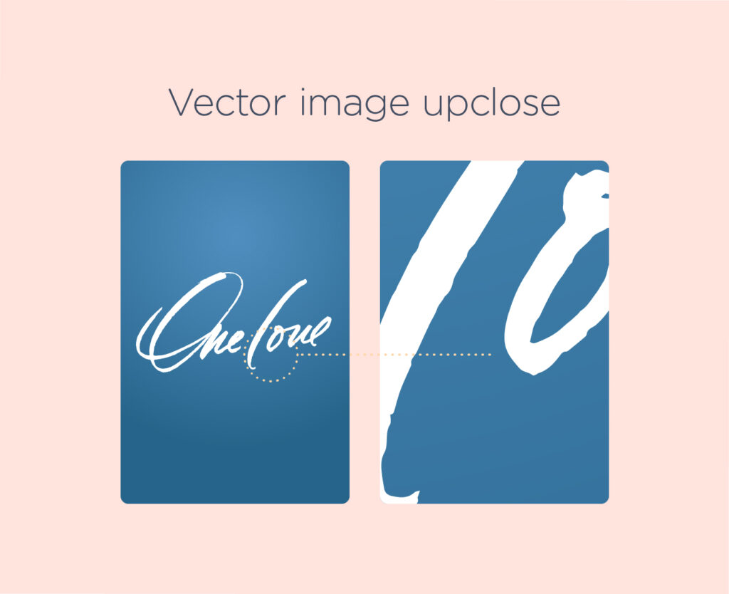
Vector images are made by using mathematical algorithms that are embedded in software programs. These algorithms establish points on a grid that can be scaled up or down without any loss of quality. Designers use vector files to create vector artwork and illustrations, such as logos, advertisements, and static images. Unlike raster image, you can modify, resize, and scale these vector images without any loss of resolution.
A sample of a vector image and how it looks up close. Notice that edges are sharp even if you zoom very closely.
Below are common vector file types
• EPS (Encapsulated PostScript)
• AI (Adobe Illustrator document)
• PDF (Portable Document Format—only when saved from vector programs)
• SVG (Scalable Vector Graphic)
Color Modes (RGB and CMYK)
As a designer, it’s important to understand the difference between RGB and CMYK colour modes since selecting the incorrect mode can significantly impact the mood and communication of your design. Let’s take a look at the characteristics and differences between RGB and CMYK and know when to use each one in your designs.
RGB (Red, Green, Blue)
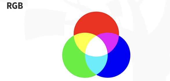
Source – https://www.interaction-design.org/literature/topics/color-modes
The RGB color profile is made up of Red, Green, and Blue hues, which mix together to form a wide range of colors. It’s exclusively used in screen displays like computer monitors, mobile phones, and TVs.
Unlike using ink, RGB works through additive processes, blending light to create color. It’s the opposite of subtractive color processes, like mixing paints or dyes. When all RGB primaries are at full intensity, you get white, and when there’s no color, you get black. RGB offers a vast array of colors; its gamut, or color range, is larger than CMYK.
Always opt for RGB when designing for screens, like digital designs or online ads.
CMYK (Cyan, Magenta, Yellow, Key color or Black)
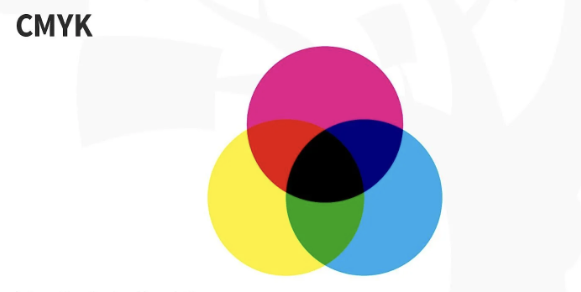
Source – https://www.interaction-design.org/literature/topics/color-modes
The CMYK color profile consists of Cyan, Magenta, Yellow, and Key (Black), which blend together to generate a spectrum of hues. This four-color process is compatible with any type of printer. When you zoom in on printed images, you’ll notice the four-color dots layered to form different hues and gradients.
CMYK modes operate through subtractive color processes, where all primaries combine to produce a somewhat dark hue, akin to mixing paints and dyes to create that not-so-pretty dark shade as a kid. As inks and dyes are layered onto each other, they subtract from the white of the paper.
Choose CMYK as your color mode when working on printed design materials such as brochures, flyers, business cards, and packaging design.
How to select your visuals effectively
The photo you select plays a significant role in how people view your design and whether they take action on it. Here are ways to effectively choose images for your design projects:
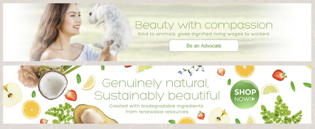
- Identify the purpose: Before selecting an image, understand what your project aims to achieve and how visuals can help. Think about how the pictures you choose can help communicate your message, stir up emotions, and get your audience to take action. Whether it’s getting more sales, making your brand more recognizable, or setting a certain vibe, make sure your visuals match your project’s main goals.
In the web banners showcased below, the designer carefully selected images that directly convey the theme of the design.
2. Image quality matters: Viewers associate the quality of your photos with the quality of the product. There are tons of resources to acquire great photographs that can elevate a decent idea into something special. Ensure that your images have sufficient resolution and size to be effectively utilized. When sourcing images from stock photo websites, always give credit as necessary.
See the comparison between the two images below:
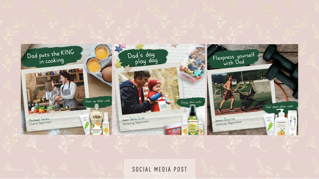
3. Make it memorable and relatable: A memorable image sticks in viewers’ minds. Unique coloring effects, creative cropping, and unexpected elements can make an image unforgettable. However, relatability is key. Choose images that resonate with your audience and support your story.
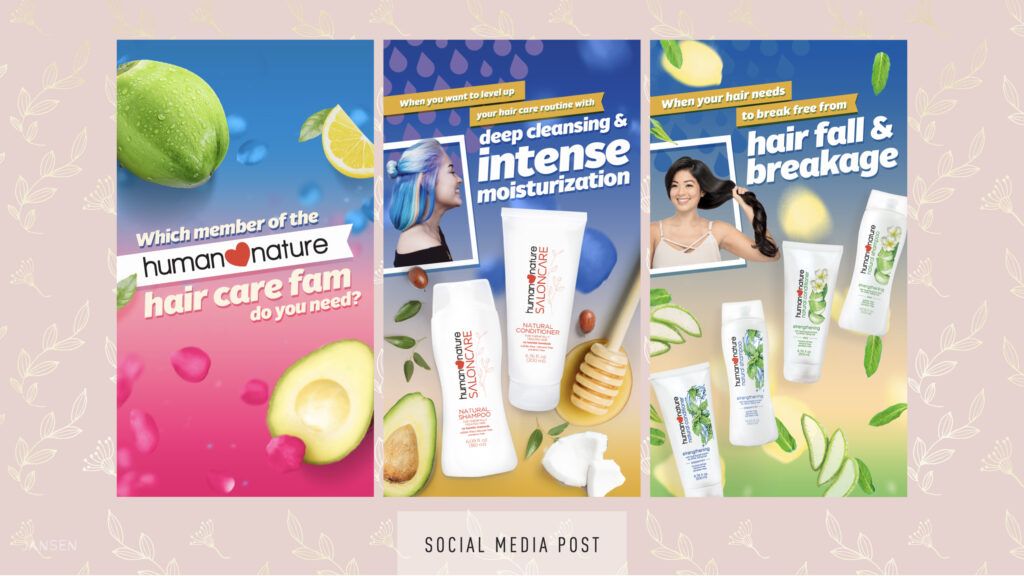
In the selection of social media posts provided below, the designer meticulously
chose relevant and captivating photos to capture the attention of their
target market effectively.
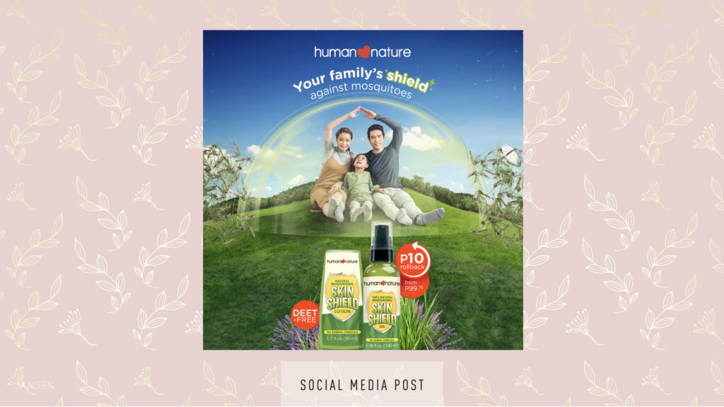
4. Aim to engage: Engaging designs evoke emotions and experiences. Your image should draw your audience into your design. Understand your audience and brand well to choose engaging photographs. Consider demographics and the perspective of your target market.
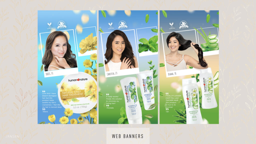
In the sample display web banners below, the models featured in the photographs represent the target audience for the showcased product. Additionally, the designer incorporated actual product shots alongside complementary images to enhance the overall design.
5. Expand your sources: Consider using various sources for visuals, including photography, illustrations, collages, or image editing software. If using stock images, ensure they are of high quality or customize them to fit your concept.
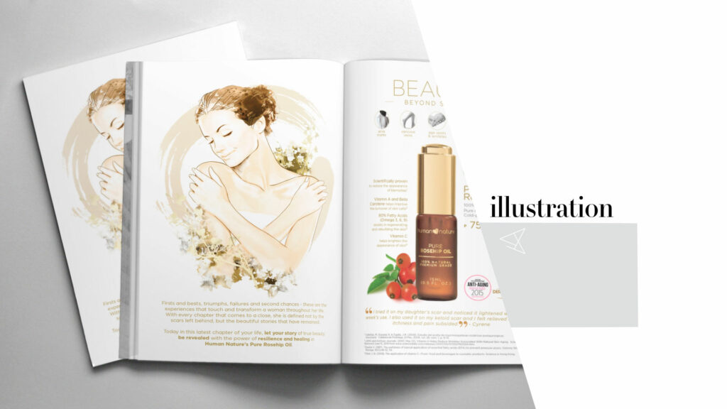
In the sample advertisement for a beauty product below, an illustration was creatively employed in lieu of the conventional photograph. This artistic choice not only imbues the ad with a distinctive allure but also elevates the product’s visibility within the spread, making it truly stand out.
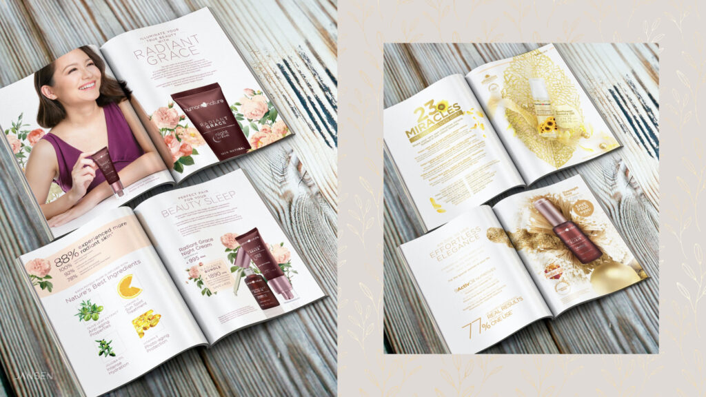
6. Be mindful of the brand: Photos should align with your brand guidelines to maintain a cohesive narrative. If using stock images, adjust them to better fit your brand’s tone and style. Pay attention to details like color, tone, and whether the people and props represent your brand appropriately.
In the following example, images undergo manipulation to adopt monochromatic tones aligned with the company’s corporate colors. This strategic decision serves not only branding purposes but also ensures that the images complement and support the content rather than overpowering the page as the focal point.
Colored or Black and White Image?
To ensure that the chosen image for your design project is utilized to its maximum potential, it’s crucial to consider the color mode. Does the design call for a colored image, or would converting it to black and white enhance its impact? Moreover, one must evaluate its suitability for the industry being targeted and its appeal to the intended audience. These are just a few factors to weigh when selecting and leveraging an image to its fullest advantage.
Here are some guiding tips to assist you in selecting the appropriate color mode:
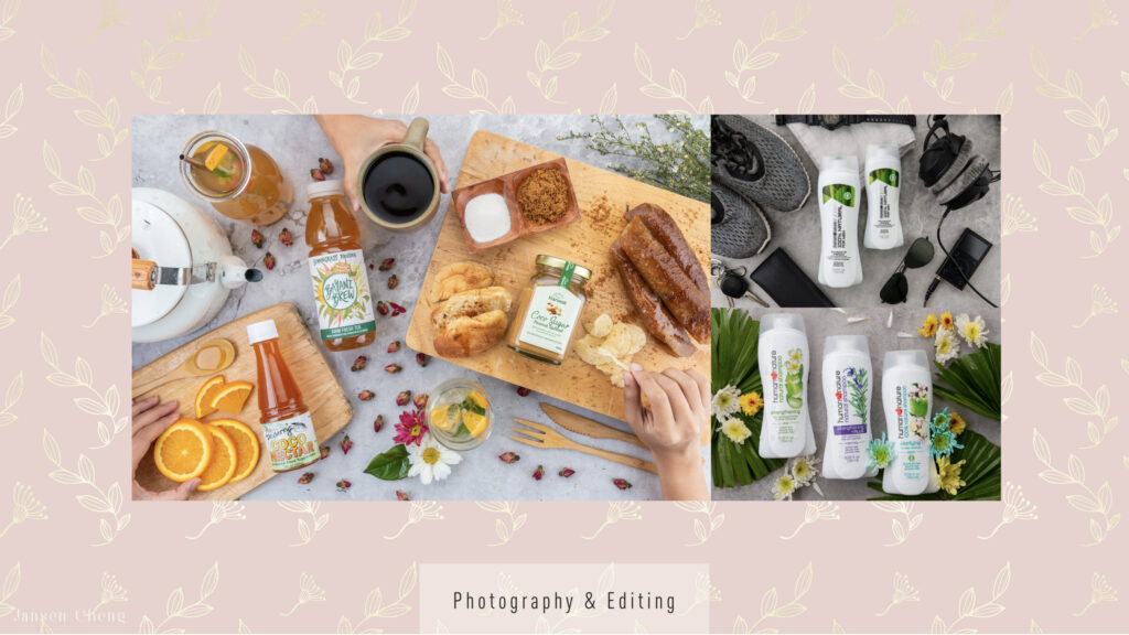
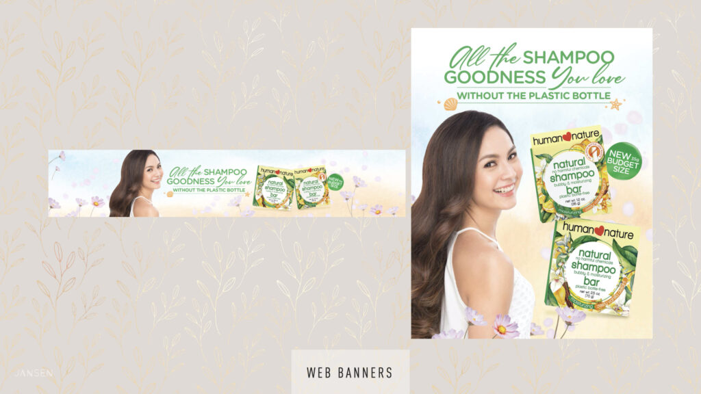
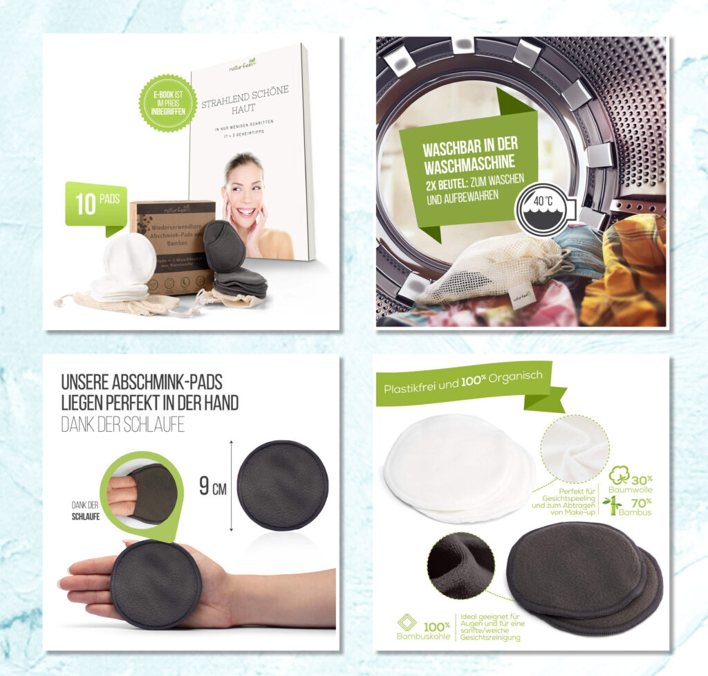
- Subject Matter: Different types of imagery suit different subjects. For instance, food photography typically shines in color, enhancing its appeal and mouthwatering qualities. Conversely, images with dramatic undertones often excel in black and white. Consider the defining factors of your image—like color—and let that guide your choice.
The sample image below showcase the visuals for a food product, men’s personal care, and personal care products utilizing natural ingredients.
The image on the left, catering to the food product, is presented in vibrant color to enhance its appetizing allure. Meanwhile, the upper-right image, designed for men’s care, adopts a black and white presentation, amplifying its masculine appeal and drawing attention to the central product.
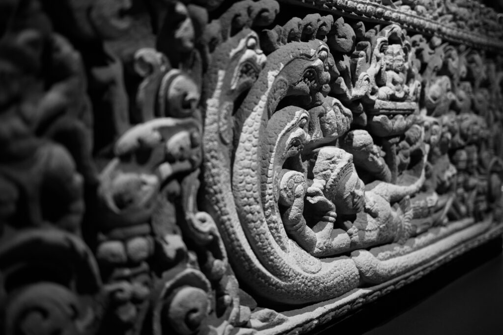
2. Texture and Patterns: Are you aiming to emphasize a product’s texture or a captivating pattern? Monochrome can accentuate texture, drawing the viewer’s attention to intricate details and patterns within the image.
A photograph taken from the exhibit, Angkor: The Lost Empire of Cambodia at the Royal BC Museum.
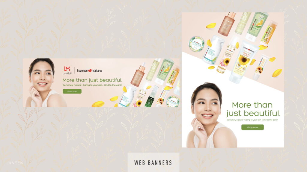
3. Contrast: Consider how your image will interact with other design elements. Should you adjust colors to maintain harmony with your brand’s palette? Utilize color theory to ensure your image complements the overall design and creates visual cohesion.
Observe how the models dons neutral-colored attire, a deliberate choice to avoid clashing with the vibrant hues dominating the overall design. Additionally, positioning the model facing towards the product enhances the composition, directing focus seamlessly towards the featured item.
4. Final Output: Contemplate the intended presentation format. Will your design be printed? Consider the printing material—whether it’s a black and white ad for a newspaper or a colored ad for newsprint. Adjusting contrast levels or simulating grayscale can optimize the image’s appearance for the intended medium.
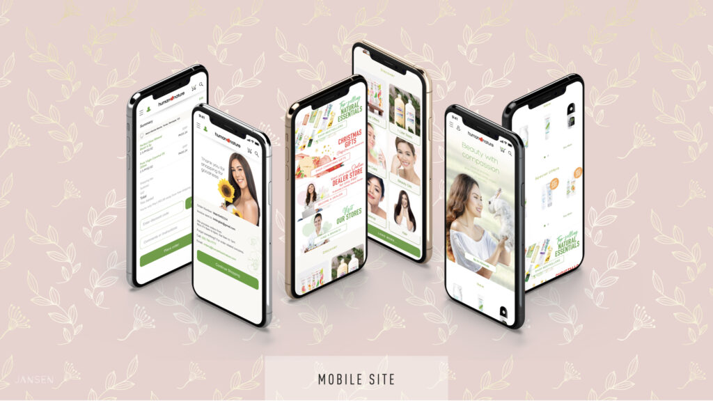
In addition to its intended use, it’s crucial to consider the orientation and aspect ratio of the design where the image will be incorporated. Will it maintain its effectiveness if presented horizontally? If the original image is vertical and needs to fit into a horizontal space, ensure the essential elements are preserved and the overall aesthetic remains intact. Additionally, take into account the requirements of various social media platforms; some prefer square images while others favor portrait orientation.
These sample images are tailored for mobile sites and social media posts, featuring close-cropped compositions optimized for small device viewing. Consideration is given to the orientation requirements of each platform to ensure seamless integration and maximum impact.
In conclusion, take the time to explore how your chosen image can be maximized within your design, ensuring it aligns with your project’s objectives and the final presentation format. By carefully considering these factors, you can leverage your image to its fullest potential while enhancing the overall impact of your design project.
How to crop your images
In addition to selecting the color mode, careful consideration of how your images will be cropped is essential to ensure they look their best. While having pre-cropped images readily available is convenient, you can use photo editing applications like Photoshop, Gimp, or other image manipulation apps if your chosen image requires cropping. However, it’s crucial not to crop photos randomly without understanding the purpose and desired effect. Otherwise, you risk diminishing their quality or visual appeal.
These are some techniques that I find useful as a designer:
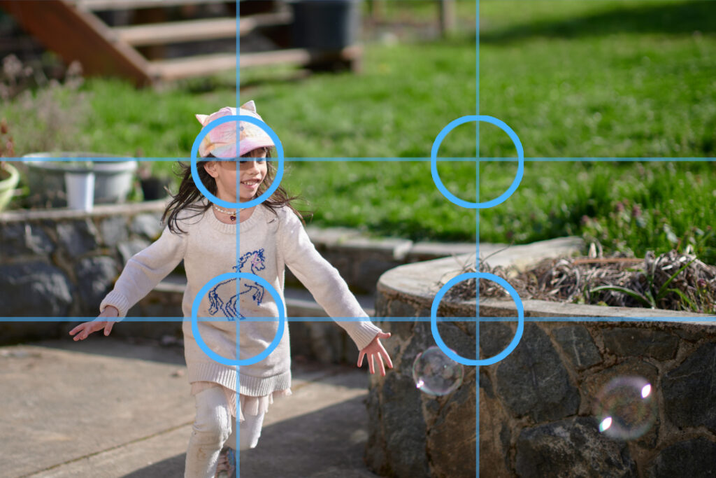
1. Use the Rule of Thirds – Employing the rule of thirds is a common method for achieving a well-balanced crop. By dividing your frame into three equal sections both vertically and horizontally, you create a grid of nine squares. Aligning key elements along these gridlines ensures effective composition.
This principle is frequently observed in film and TV, where subjects often occupy the left or right third of the screen. Additionally, consider exploring the golden ratio, also known as the golden spiral, for alternative compositions.
If you are using an image that comes with a background, frame it in such a way that the subject falls on one of the intersection points of the grid.
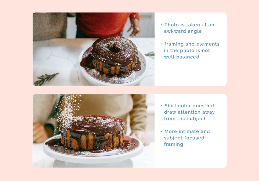
2. Crop with caution– Drawing in close to your subject can evoke drama and intimacy, directing focus to specific persons, objects, and product.
While close cropping can enhance impact, it’s crucial to exercise restraint. When cropping an image of a person, be mindful in cropping at the elbows, knees, fingers, hips and head. Extreme close cropping should be employed deliberately for specific effects while maintaining overall composition awareness.
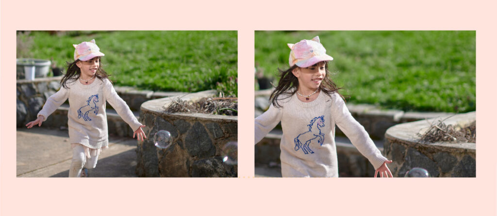
Good cropping VS Bad cropping
The image on the left demonstrates the application of the rule of thirds, positioning the subject at an intersection point for optimal composition. It’s cropped effectively to encapsulate the emotion portrayed in the photo. Conversely, the second image was over-cropped, resulting in the loss of essential elements like the bubbles, detracting from the image’s essence. Additionally, cropping at the elbow and fingers was not ideal, as it compromises the integrity of the image composition.
3. Explore and get creative – Experiment with placing your images within different shapes or incorporating creative borders to infuse uniqueness into your visuals. The extent of cropping and arrangement of image elements should be guided by creative direction of your design. Take the opportunity to explore and practice using various image manipulation software.
The image below is intended for use in an e-commerce website. The brushes from the original photos were replace with the actual products. The photo needed to be converted to a square format as well so the foreground and the upper part needed to be extended through photo manipulation using Adobe Photoshop.
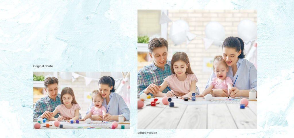
An example on how you can crop your photos and place them in containers to highlight the feature of the product.
Technical References
Read/Watch
1. Watch this video about the fundamentals of incorporating images into graphic design. It provides guidance on locating high-quality stock images and offers techniques for editing images through cropping, resizing, and other adjustments
2. Image editing softwares such as Adobe Photoshops enables you to enhance specific aspects of your image, such as color mode, cropping, adjusting contrast. brightness, and saturation.
However, not everyone has access to such software, so here are a few free:
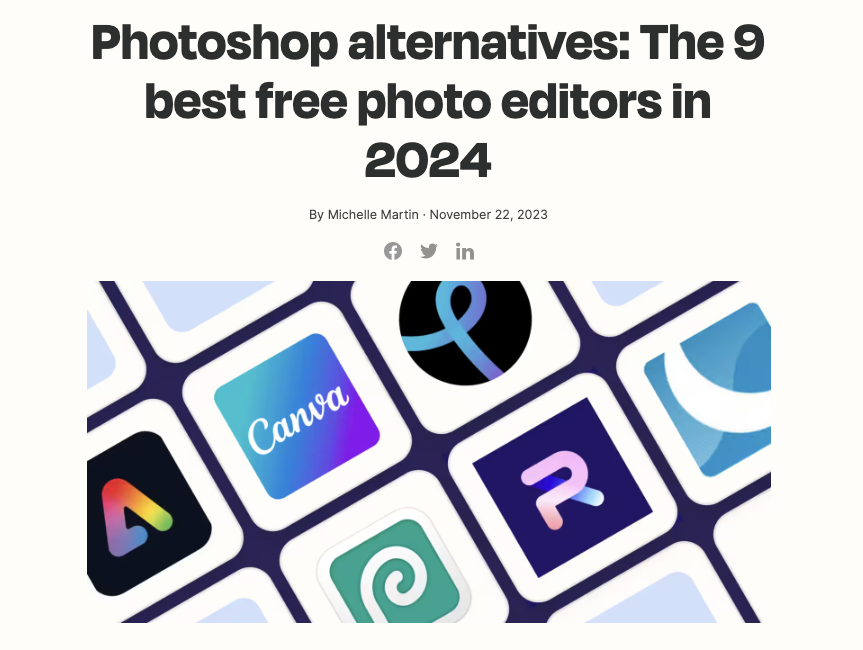
Link – https://zapier.com/blog/photoshop-alternatives-best-free-photo-editors/alternatives.
3. Read- How to Choose Between Color and Black & White (and Why It Even Matters)
https://phlearn.com/magazine/how-to-choose-between-color-and-black-white/
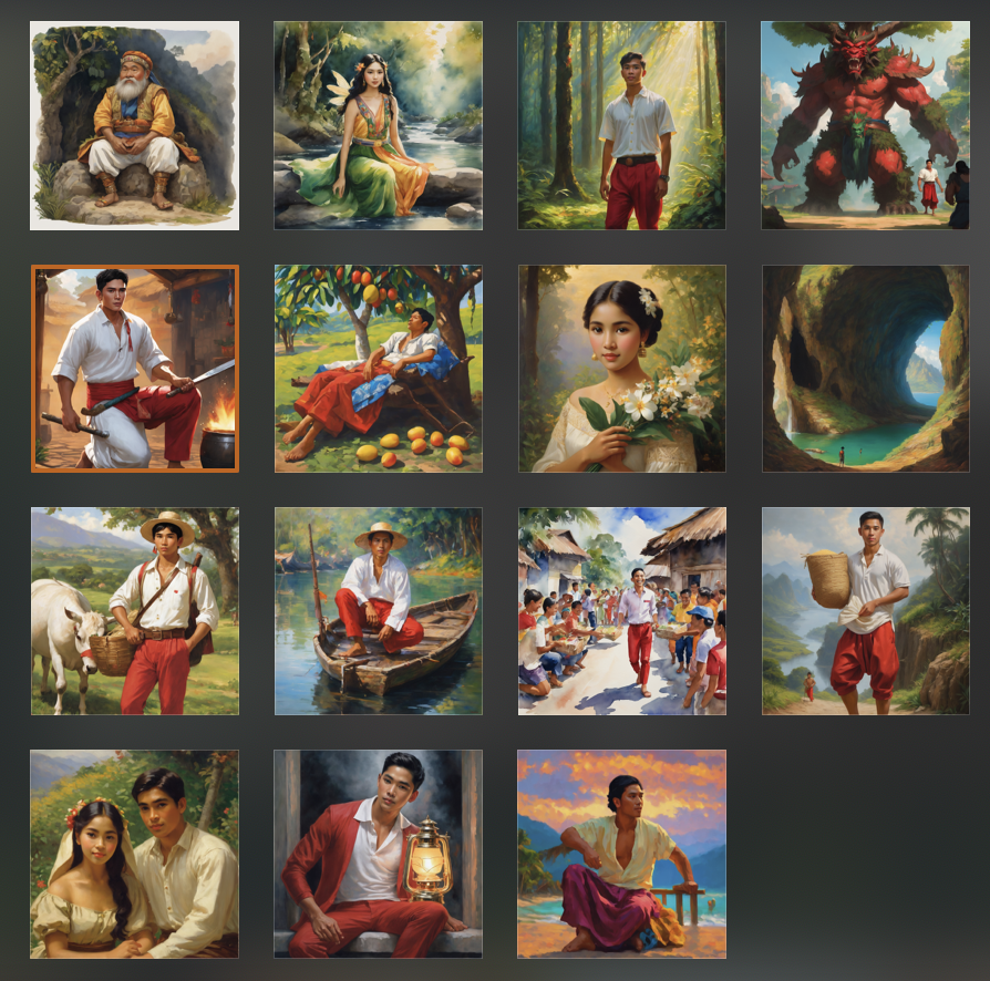
4. AI generated images – AI can also be a source of your visuals for a design project.
I employed Padlet, a Generative AI-powered tool, to generate these images and I was pleasantly surprised by the speed and accuracy of the results. While there were some minor inaccuracies, they did not significantly impact the overall quality. I successfully achieved the desired artist-inspired look for my images.
5. Read about How to Choose Diverse and Inclusive Photos – https://www.forumone.com/insights/blog/how-to-choose-diverse-and-inclusive-photos/
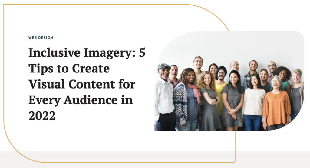
6. Read about – Inclusive Imagery: 5 Tips to Create Visual Content for Every Audience in 2022 – https://wiredimpact.com/blog/inclusive-imagery-5-tips-to-create-visual-content-for-every-audience-in-2022/
Source: https://wiredimpact.com/blog/inclusive-imagery-5-tips-to-create-visual-content-for-every-audience-in-2022/
7. Source of royalty free photos
1. Pixa Bay – https://pixabay.com
High quality stock images, videos and even music.

2. Pexels – https://www.pexels.com
Best source of free stock photos, royalty free images & videos shared by creators.
3. Freepik – https://www.freepik.com
High-quality photos, videos, vectors, PSD, AI images, and icons
4. Unsplash – https://unsplash.com
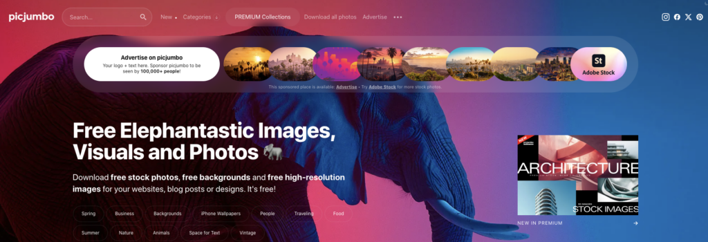
5. Picjumbo – https://picjumbo.com
Free stock photos, free backgrounds and free high-resolution images for your websites, blog posts or designs.
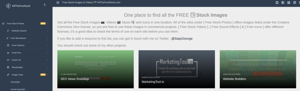
6. All the free stock – https://allthefreestock.com/#
Free Stock Images & Videos
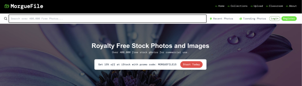
7. Morguefile – https://morguefile.com
Free stock photos for commercial use
8. Goodfreephotos – https://www.goodfreephotos.com
9. Burst – https://www.shopify.com/stock-photos
Free stock photos and royalty-free images

Suggested Learning activities
1. Encourage students to engage in photography or explore various sources for royalty-free images. Guide them in curating a personalized photo collection tailored for their design projects. Prompt them to label and categorize these images to facilitate easy access when required. Emphasize the importance of ensuring that downloaded images are indeed royalty-free and suitable for commercial use. Encourage students to provide appropriate credit if mandated by the source website.
2. Ask students to capture images of various subjects around the school. Printing them in black and white is acceptable. Prompt them to evaluate each image and apply their knowledge of proper cropping techniques. Did the composition adhere to the rule of thirds? Would a different orientation, such as vertical instead of horizontal, enhance the photo? Are there any distracting elements diverting attention from the main subject?
3. Task students with using a free photo editor to manipulate the image into a different color mode, such as monochrome or black and white. Encourage them to consider the following questions: Did the change of color mode made the image more impactful? Did it enhance its appeal? Prompt them to experiment with adjusting brightness, saturation, and contrast to further refine the image.
Leave a Reply
You must be logged in to post a comment.